Viz for Social Good: VFSG Impact, 2017-2023
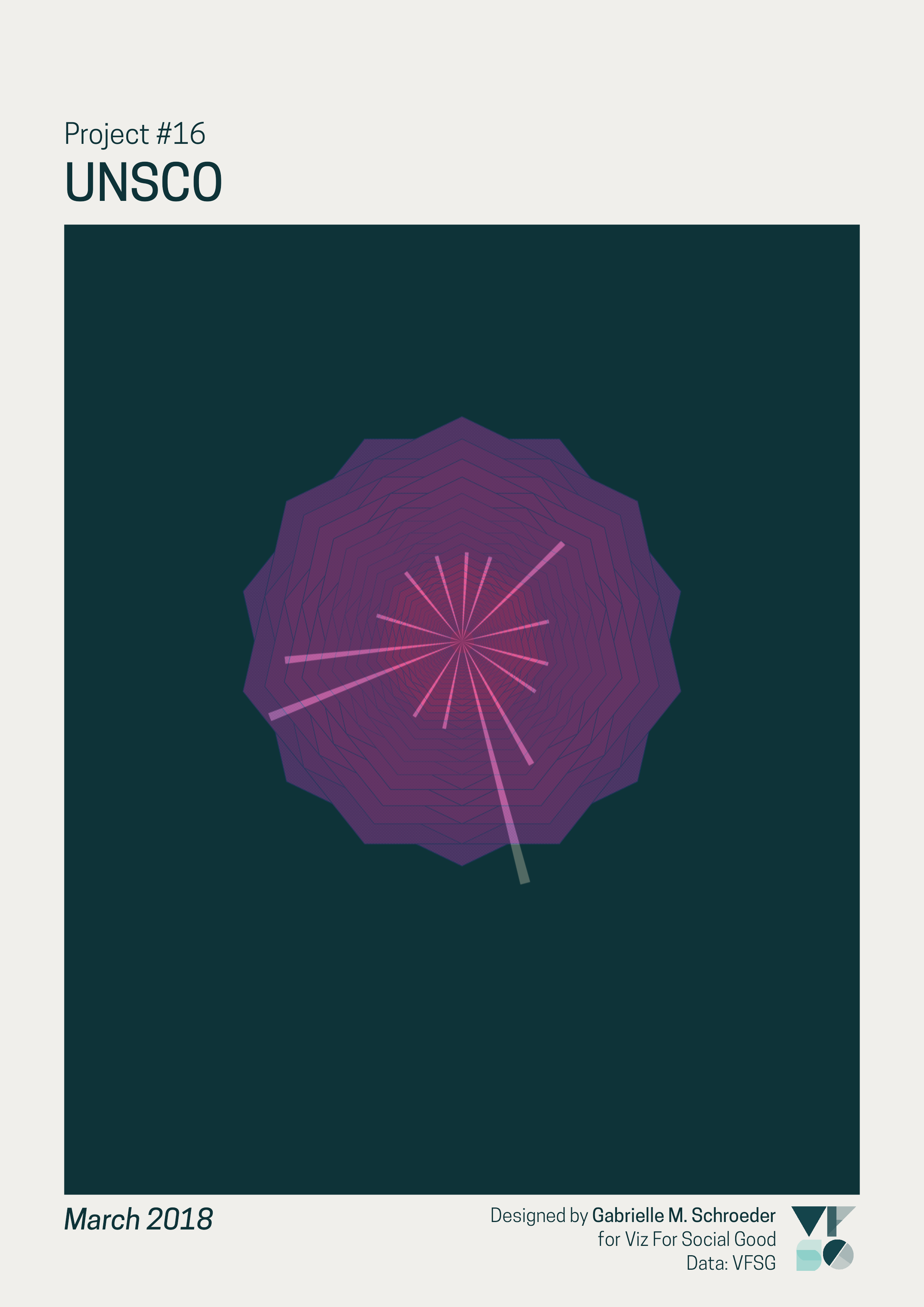
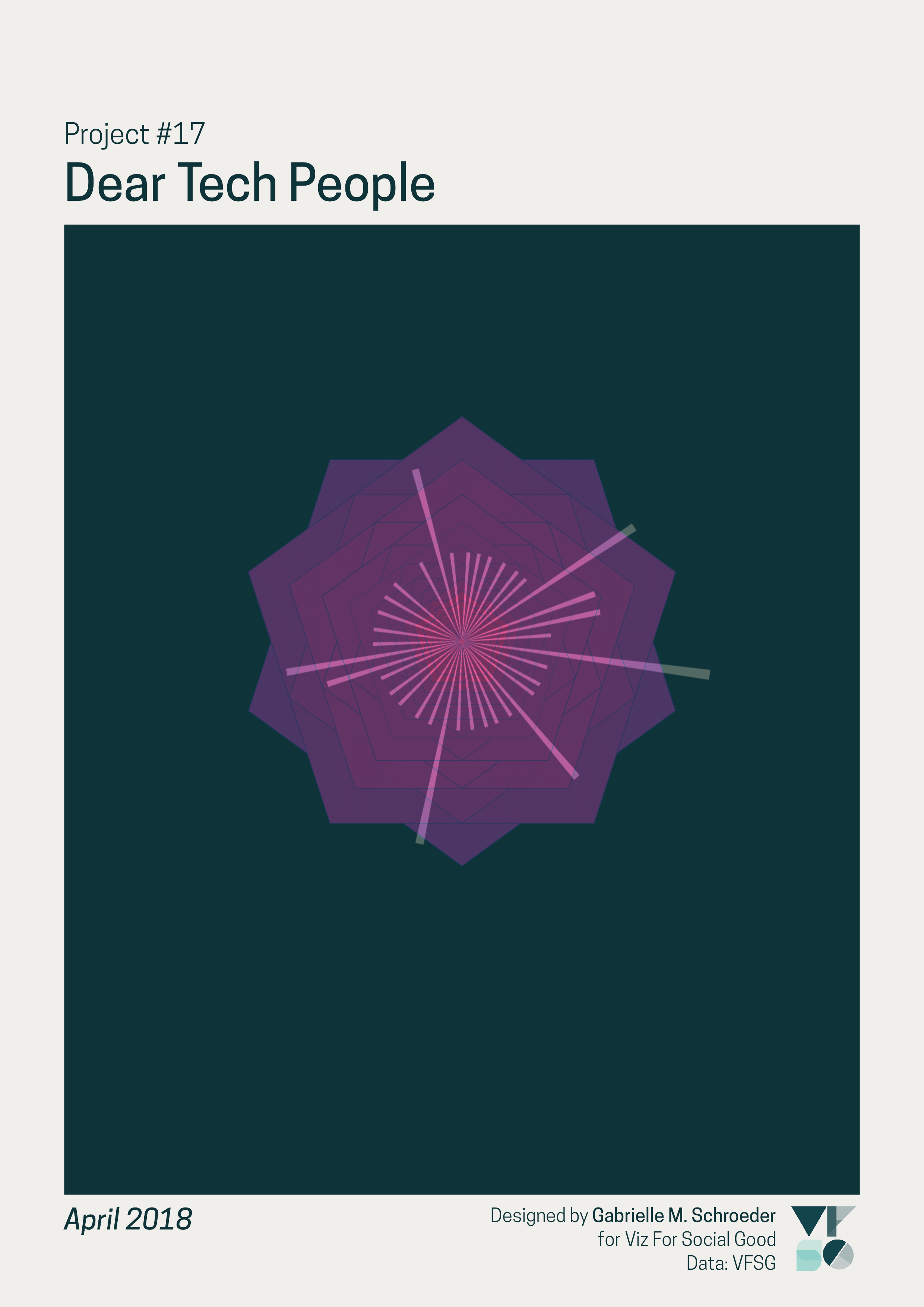
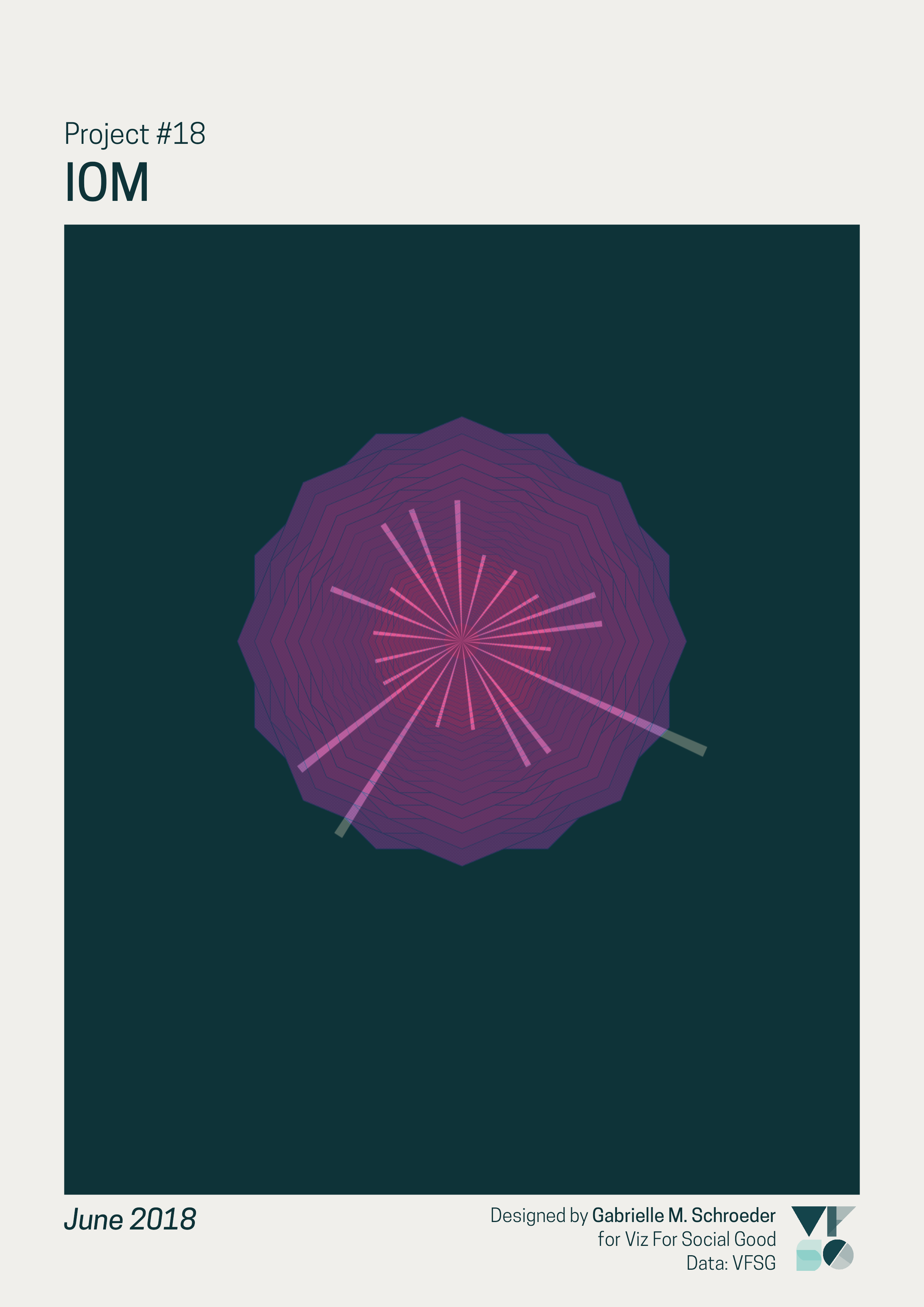
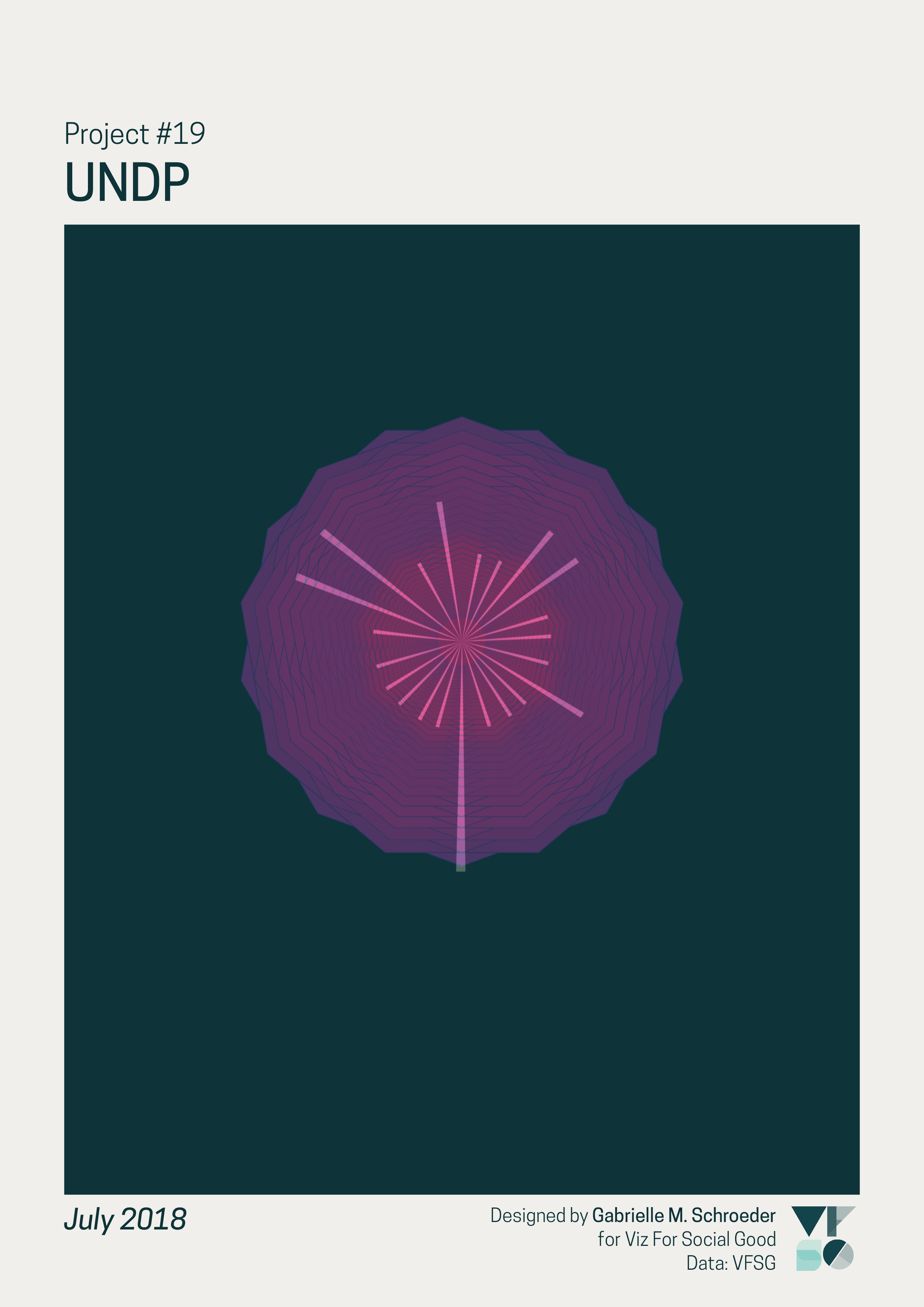
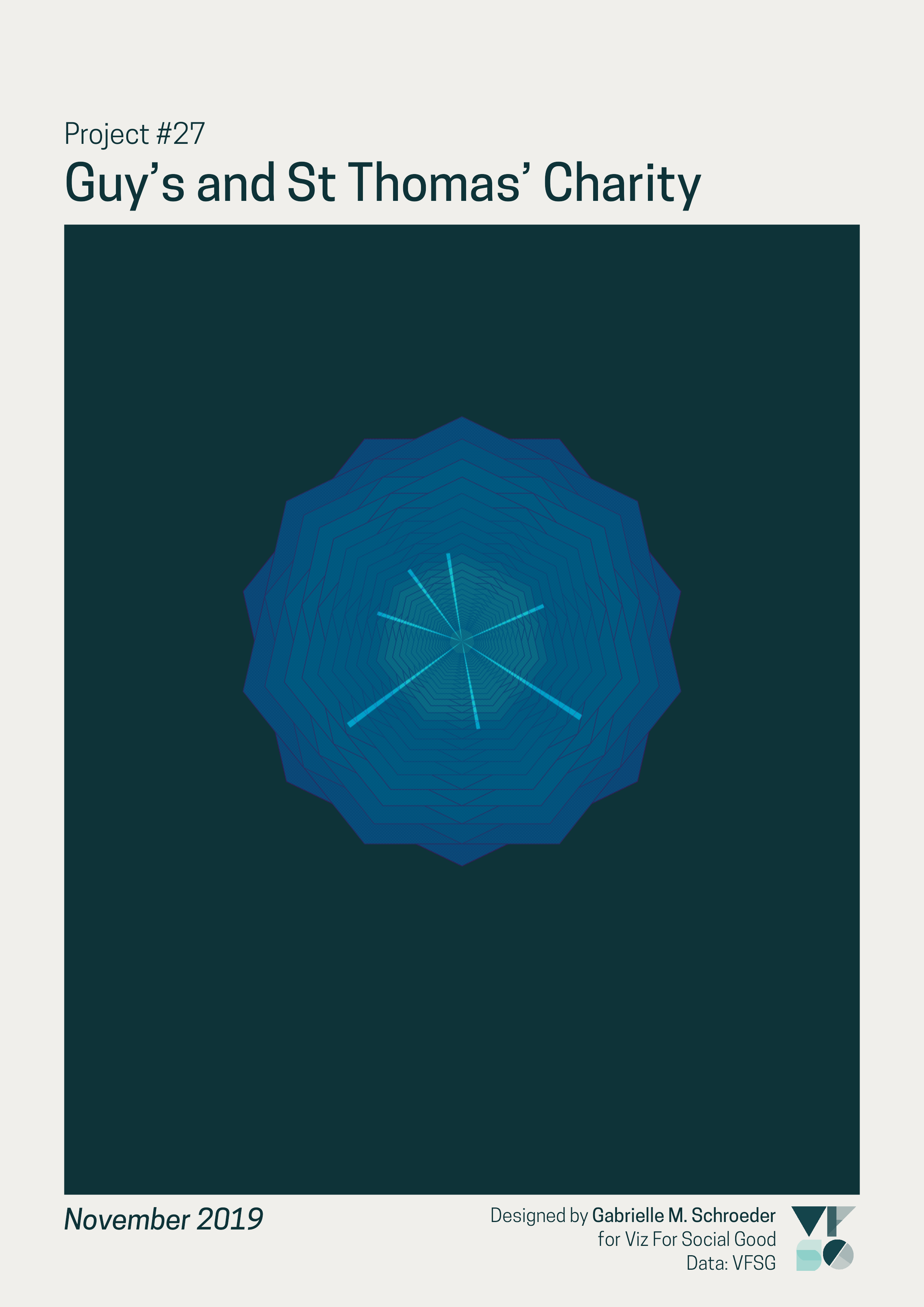
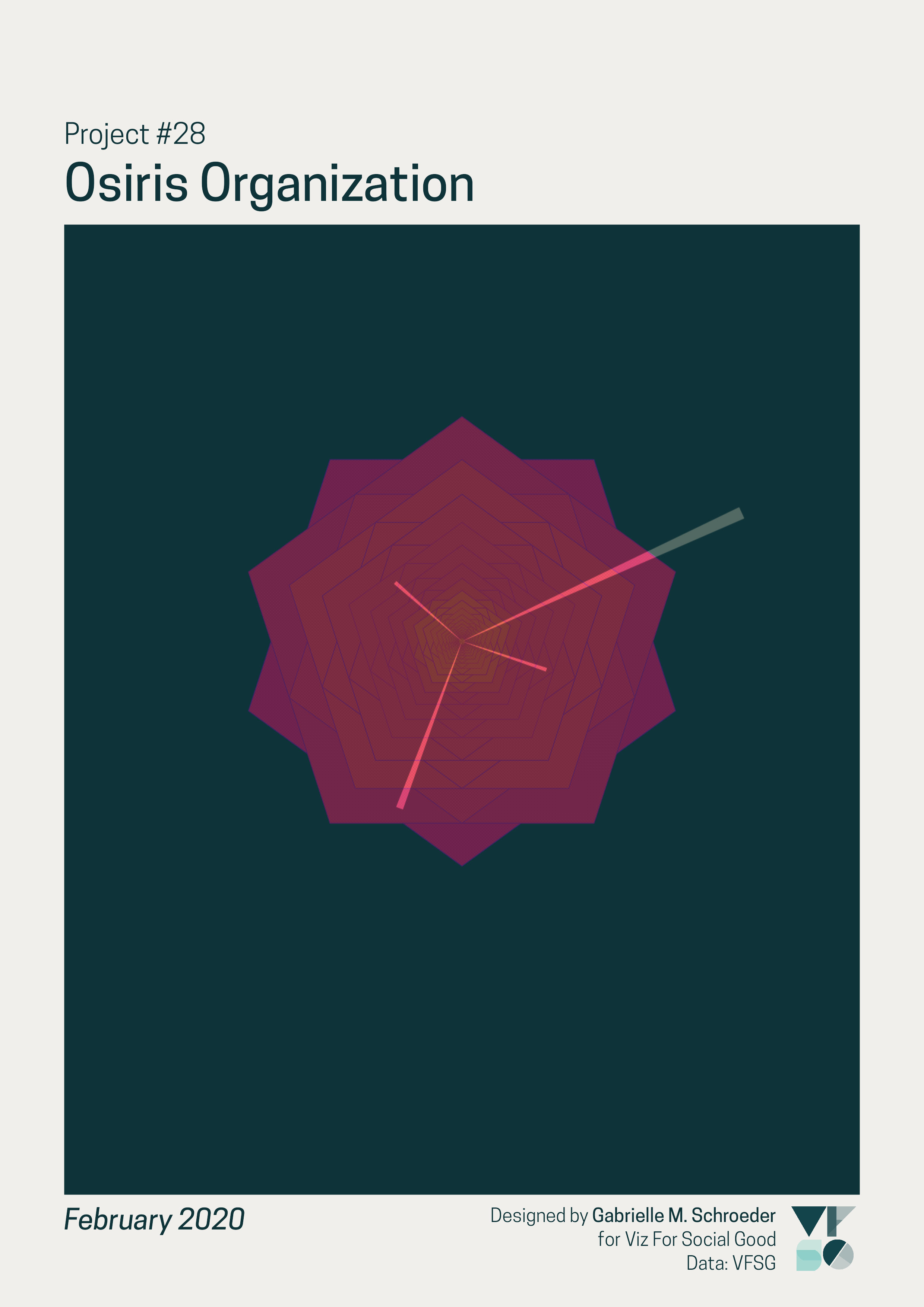
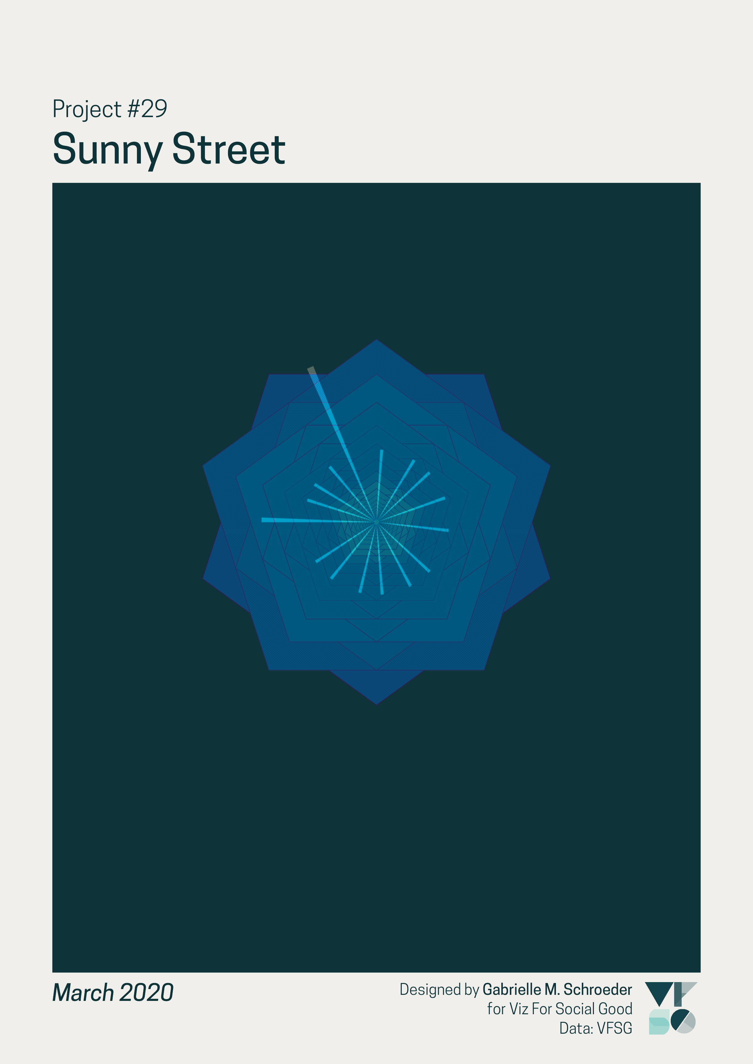
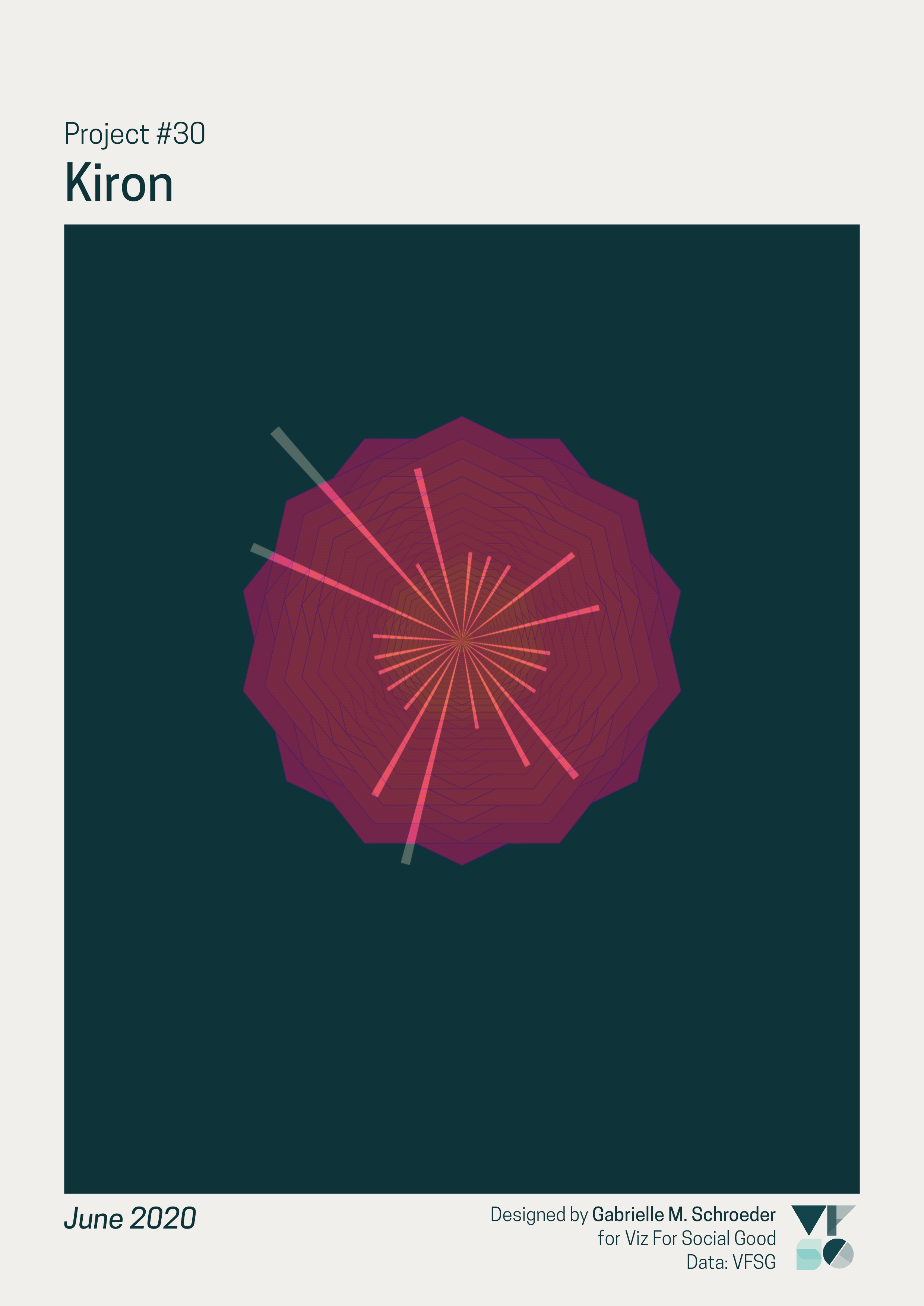
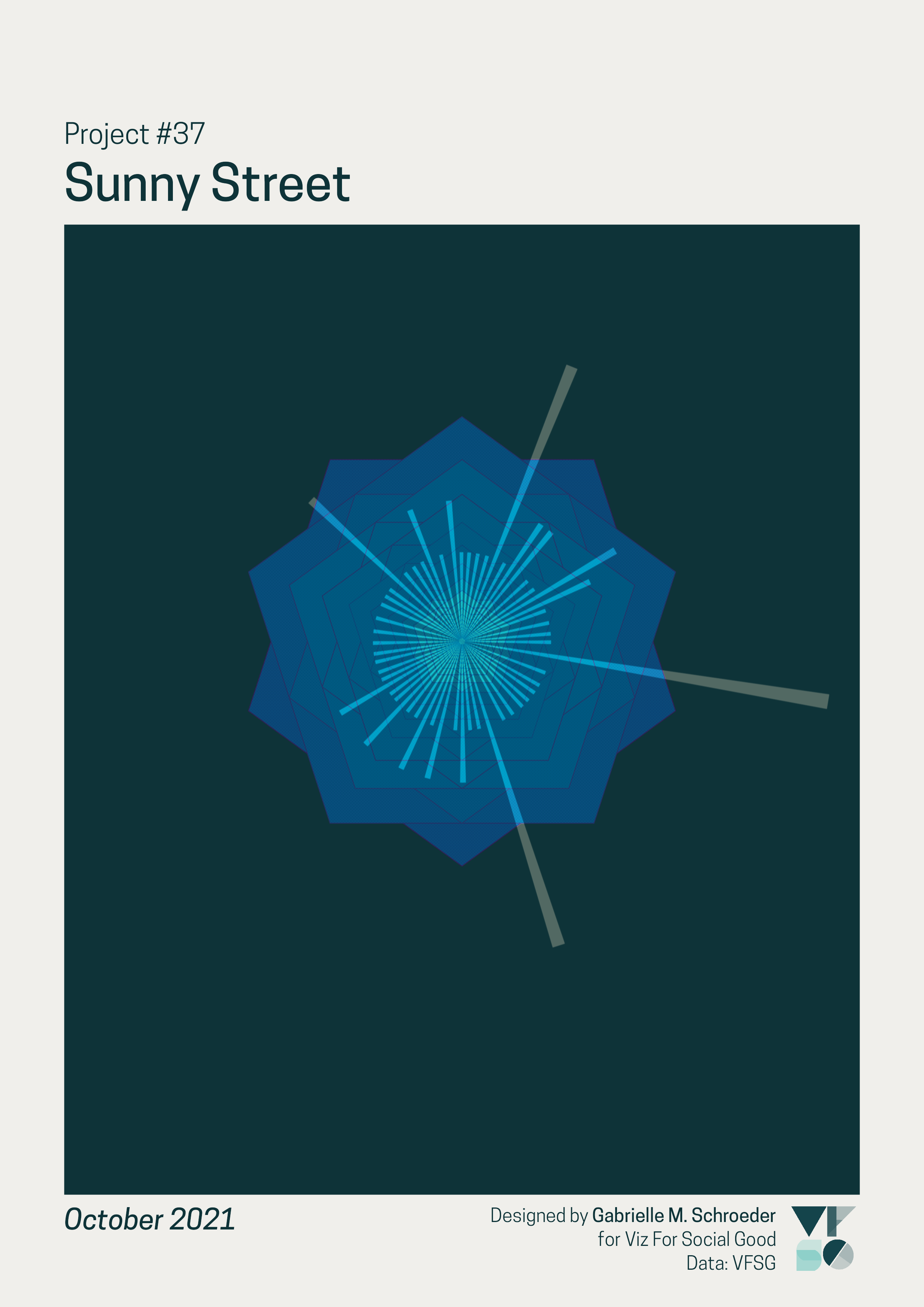
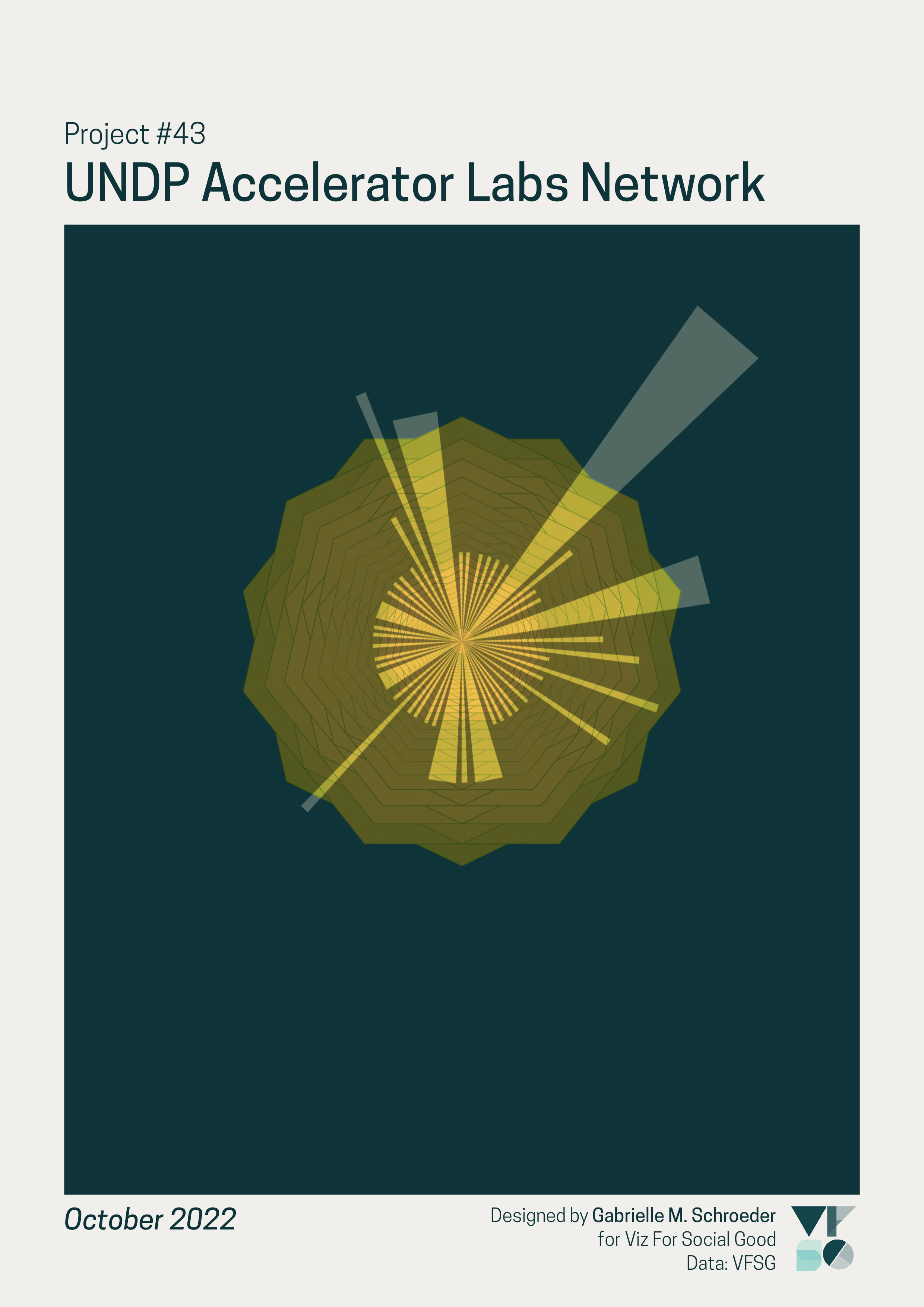
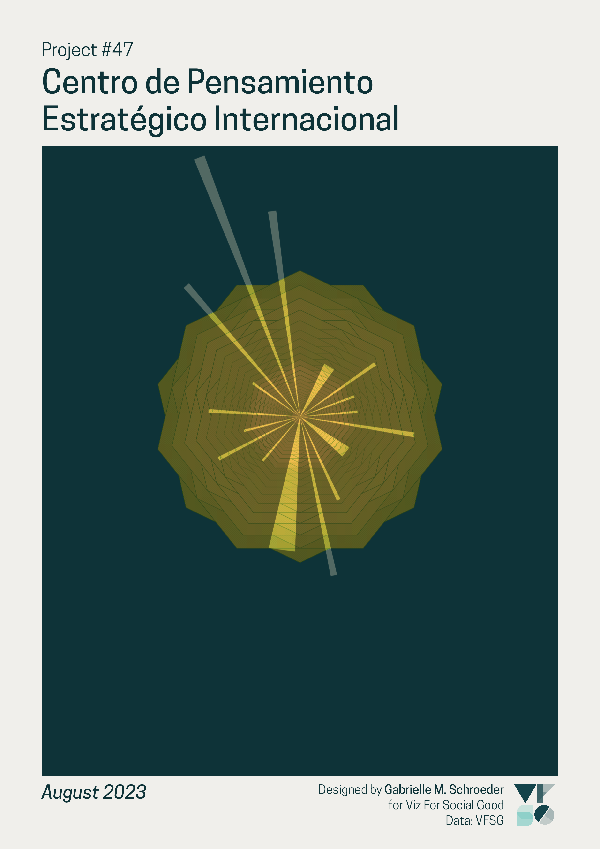
This Viz For Social Good (VFSG) project focused on VFSG’s own data on volunteer submissions and non-profit partners. I chose to make data art of each past VFSG project, with the goal of creating engaging visualisations that also celebrate VFSG’s community and growth.
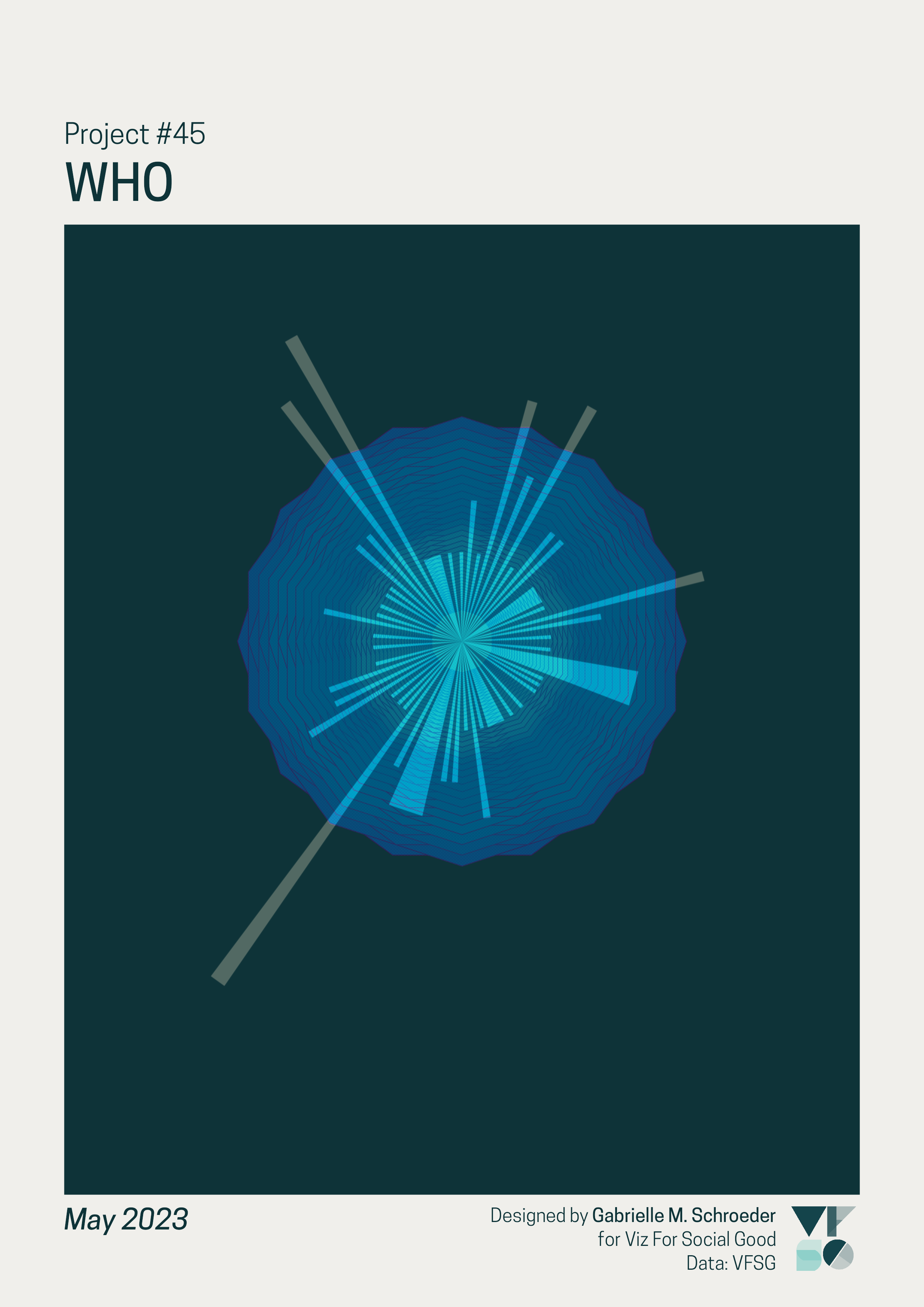
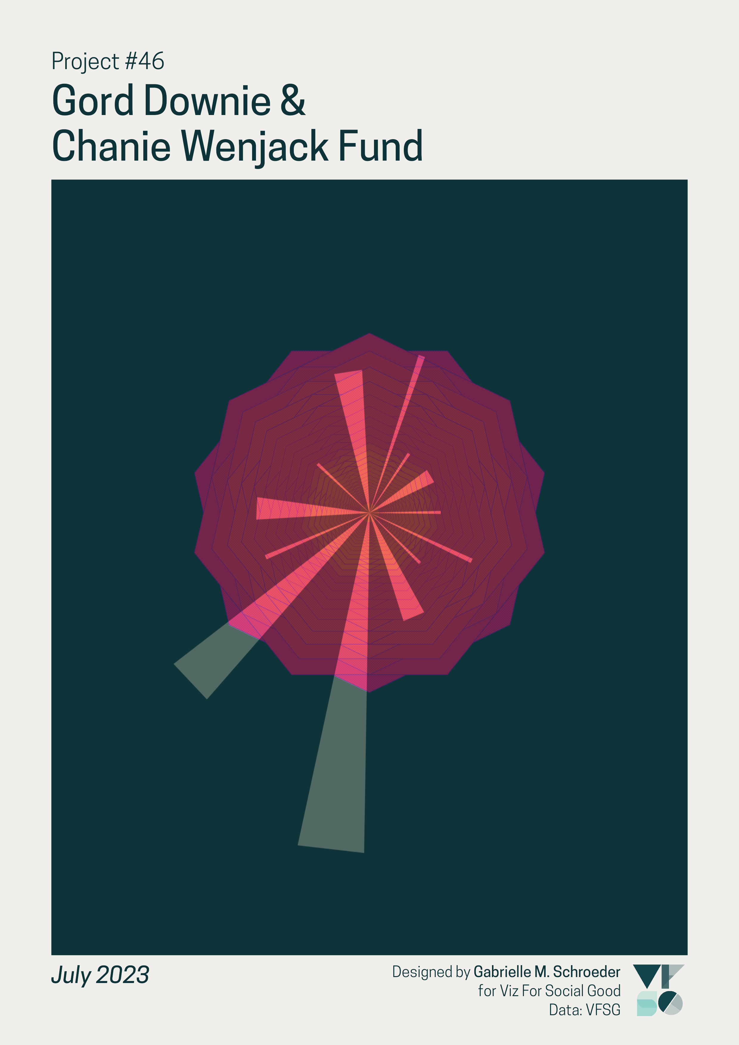
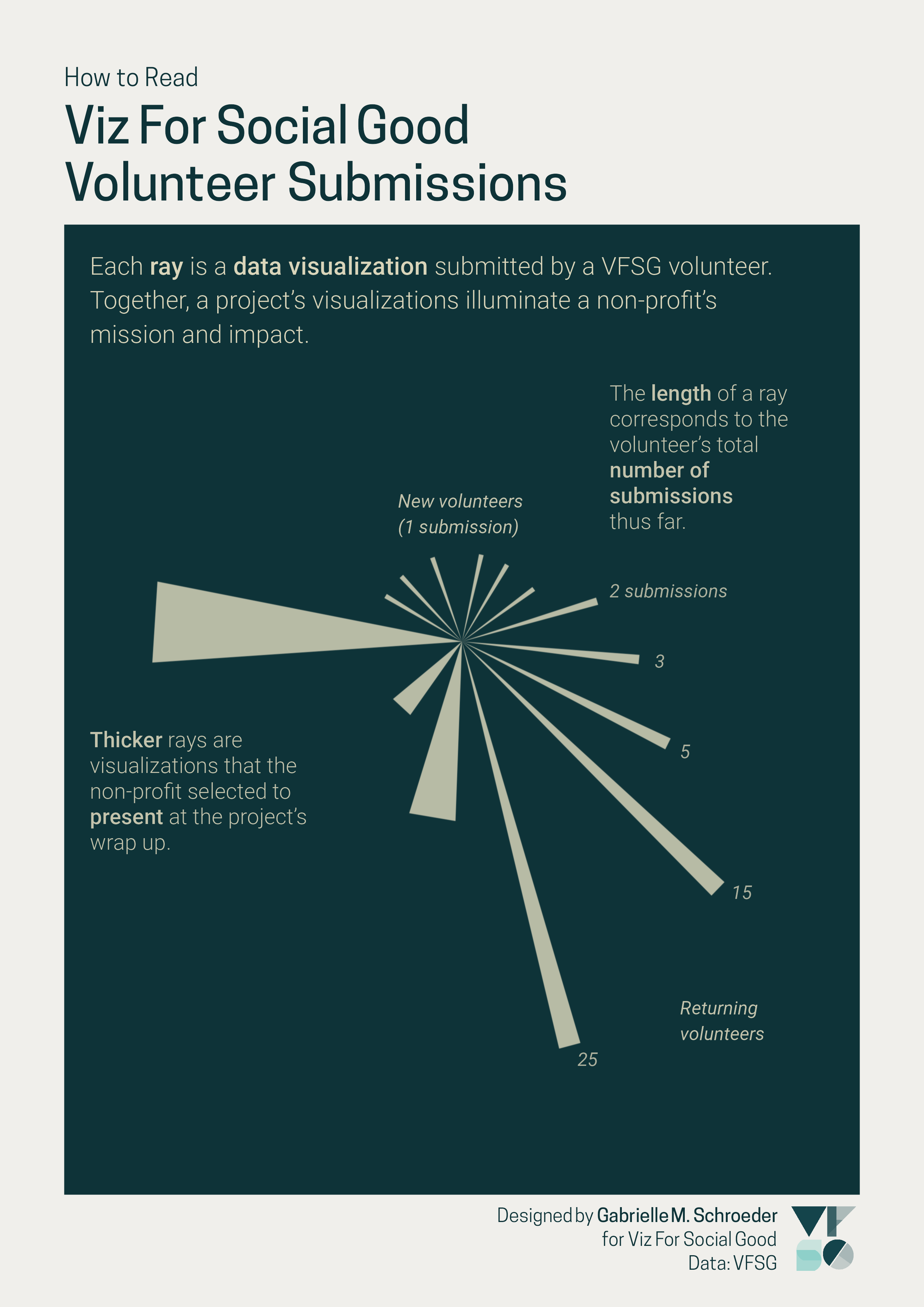
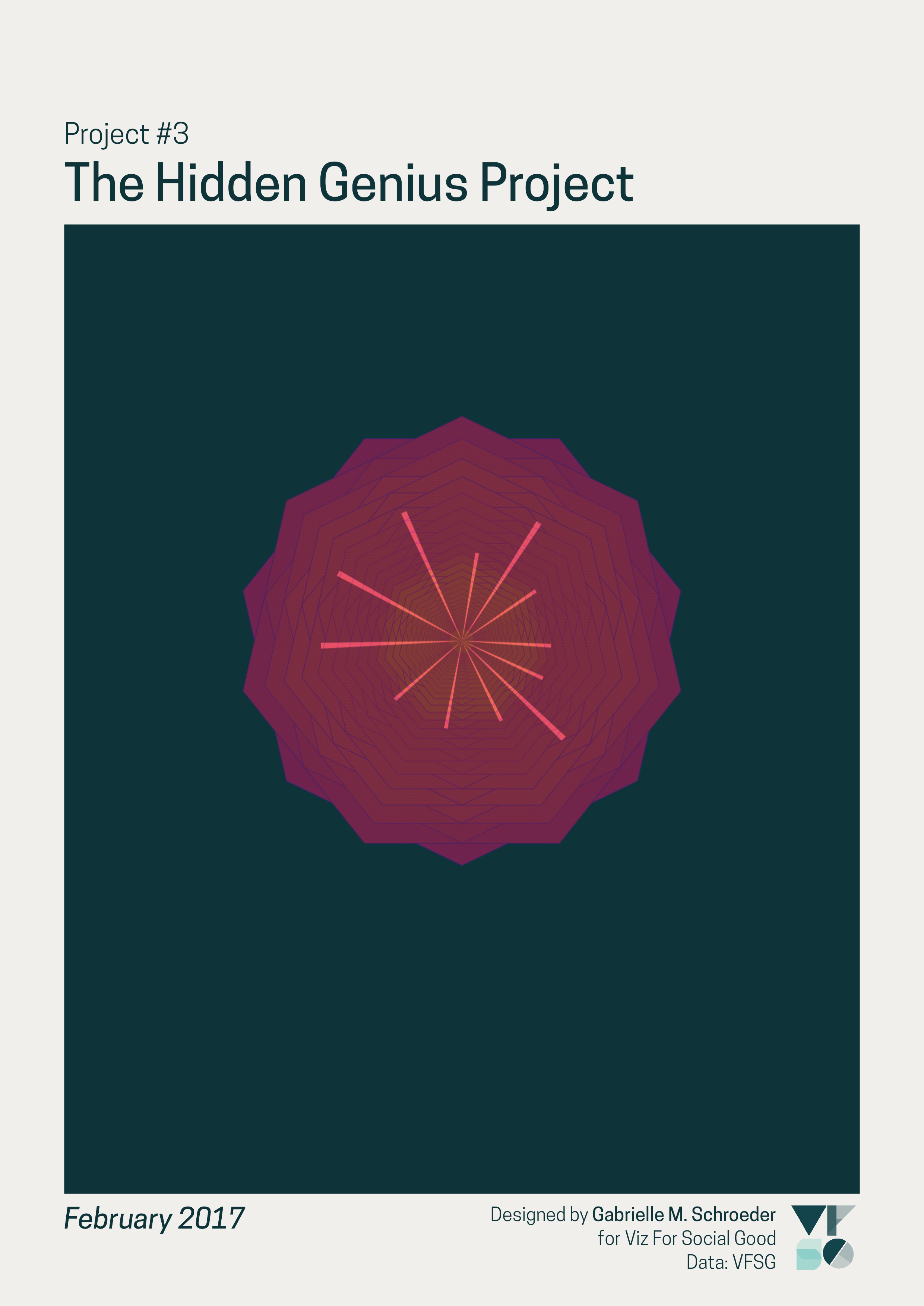
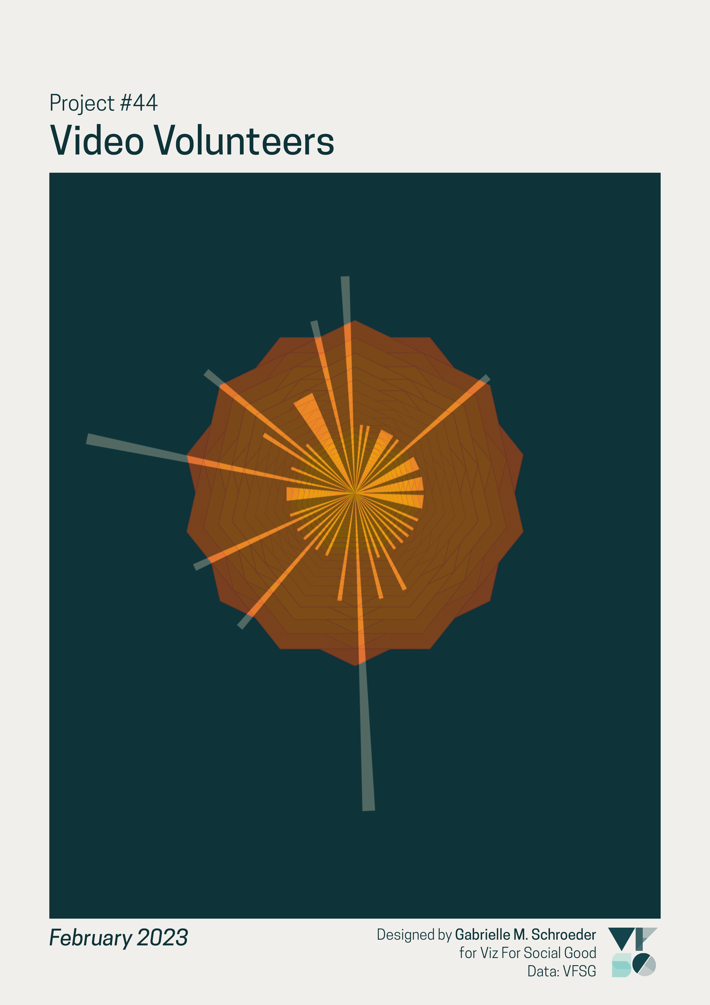
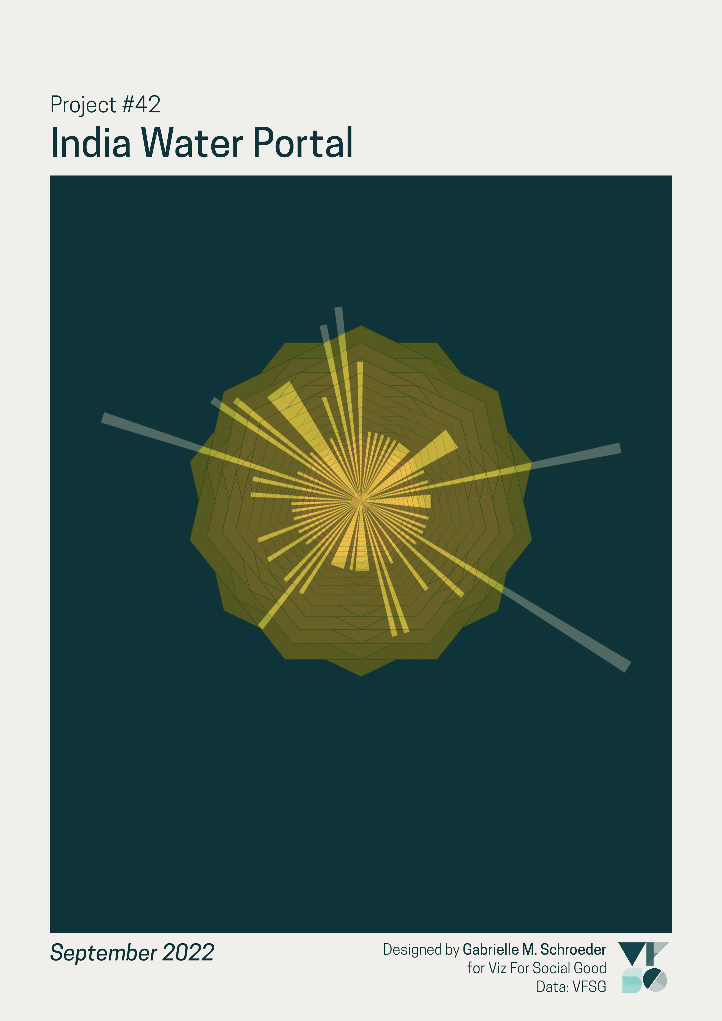
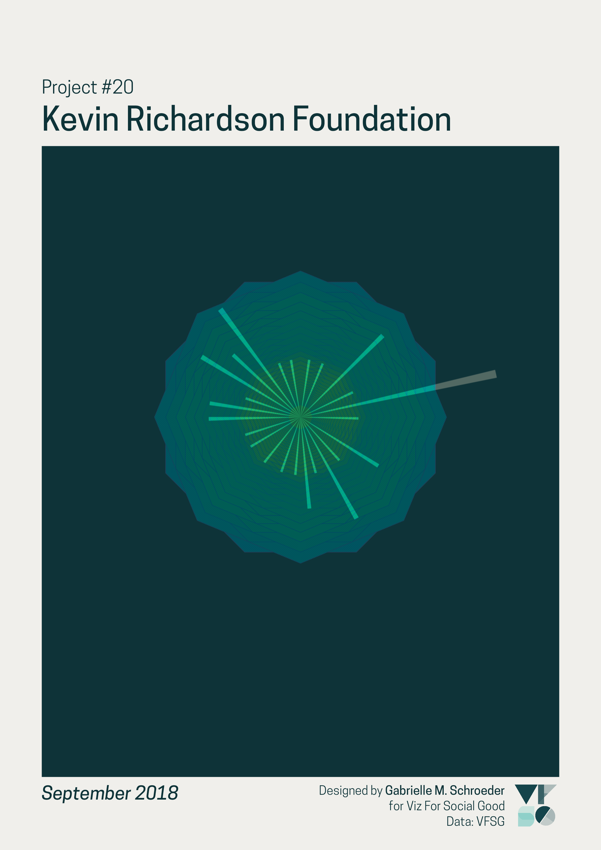
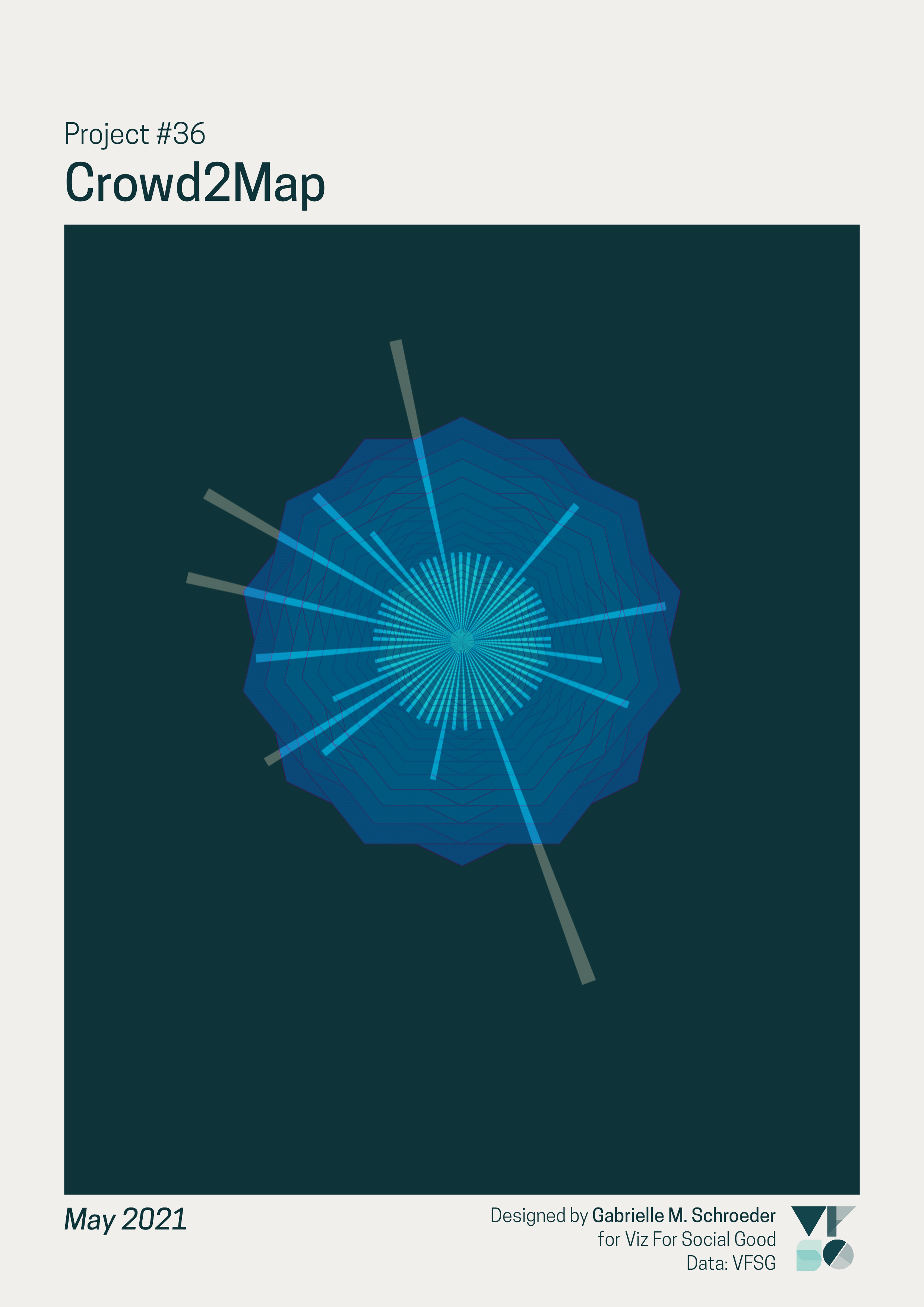
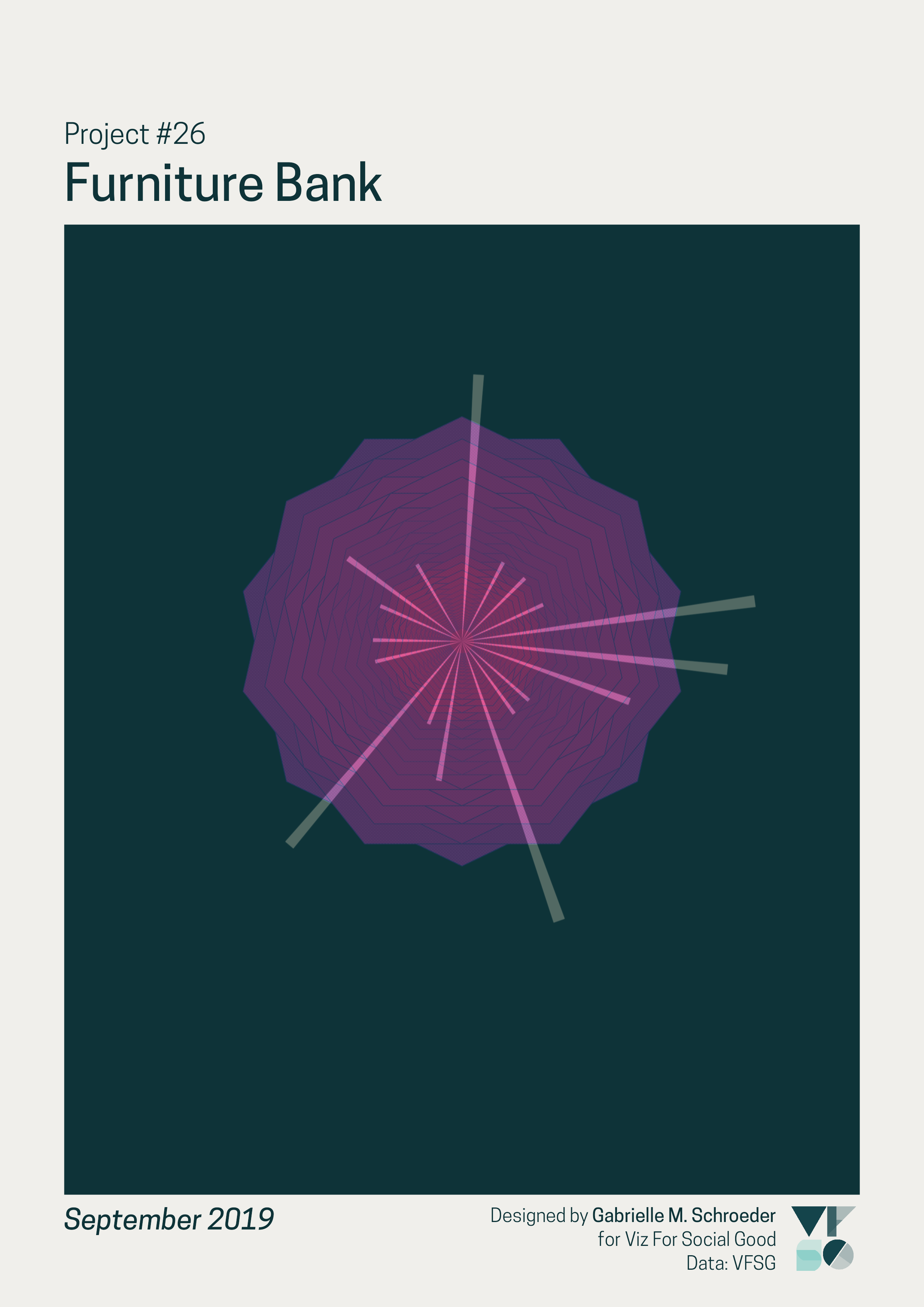
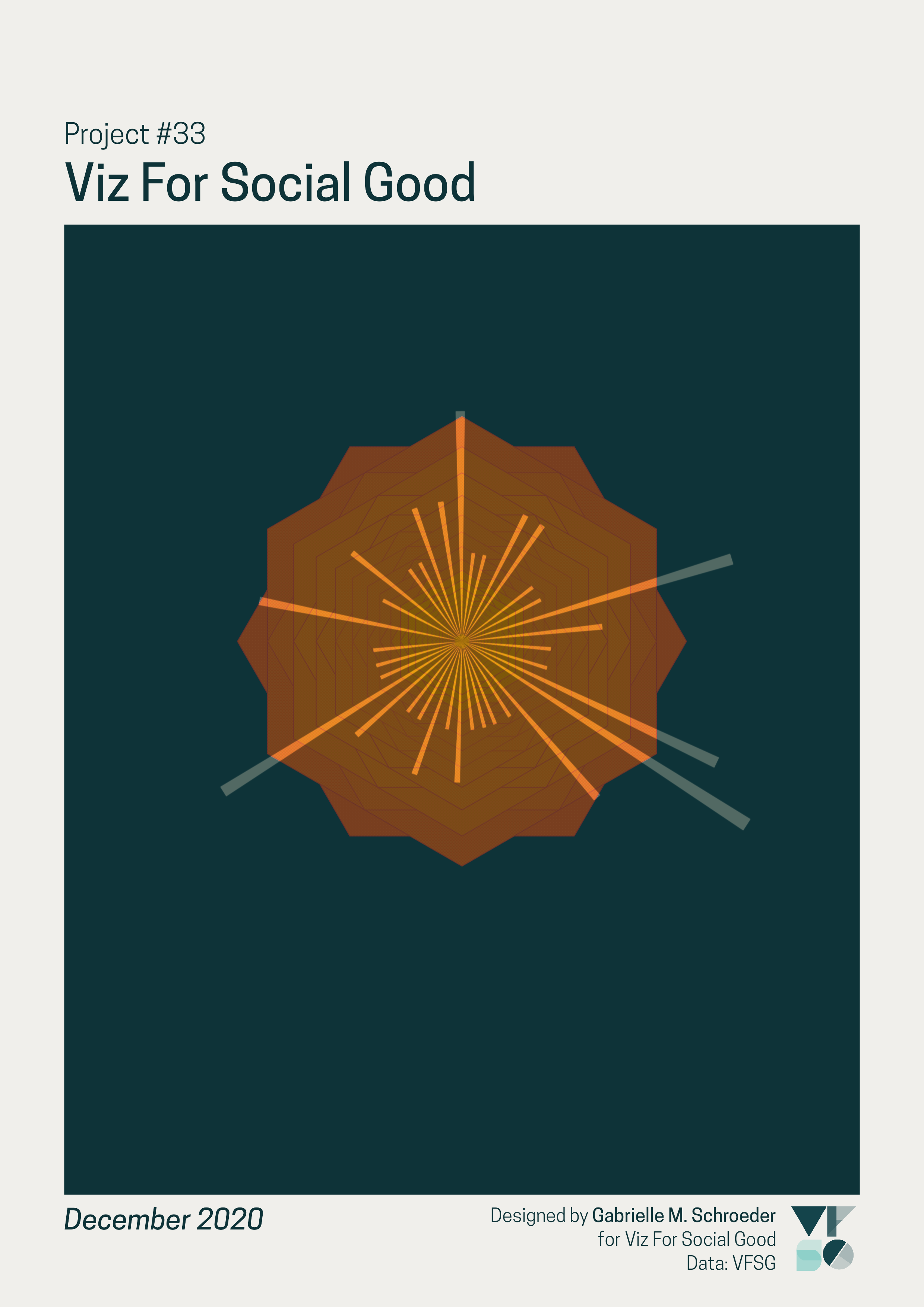
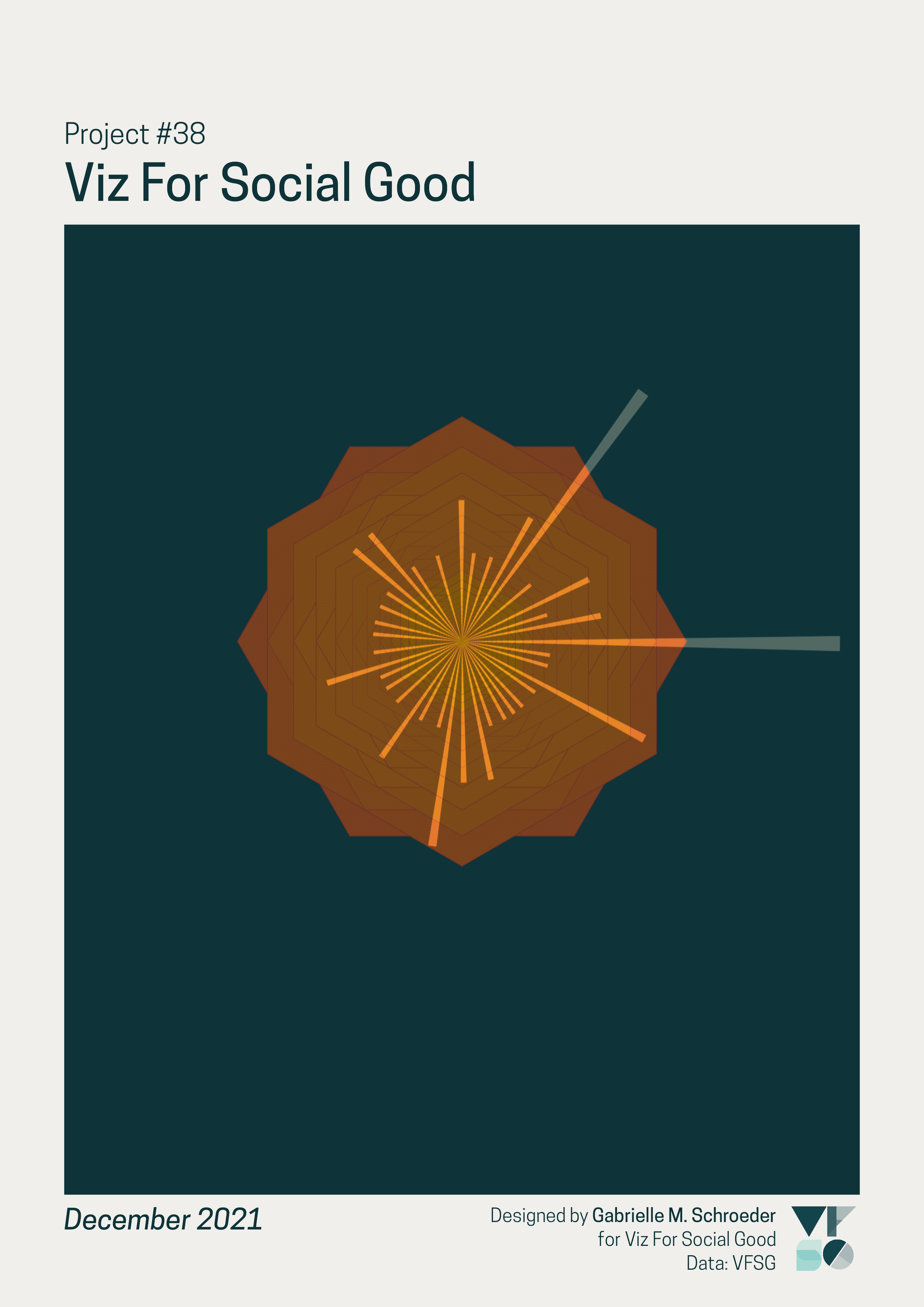
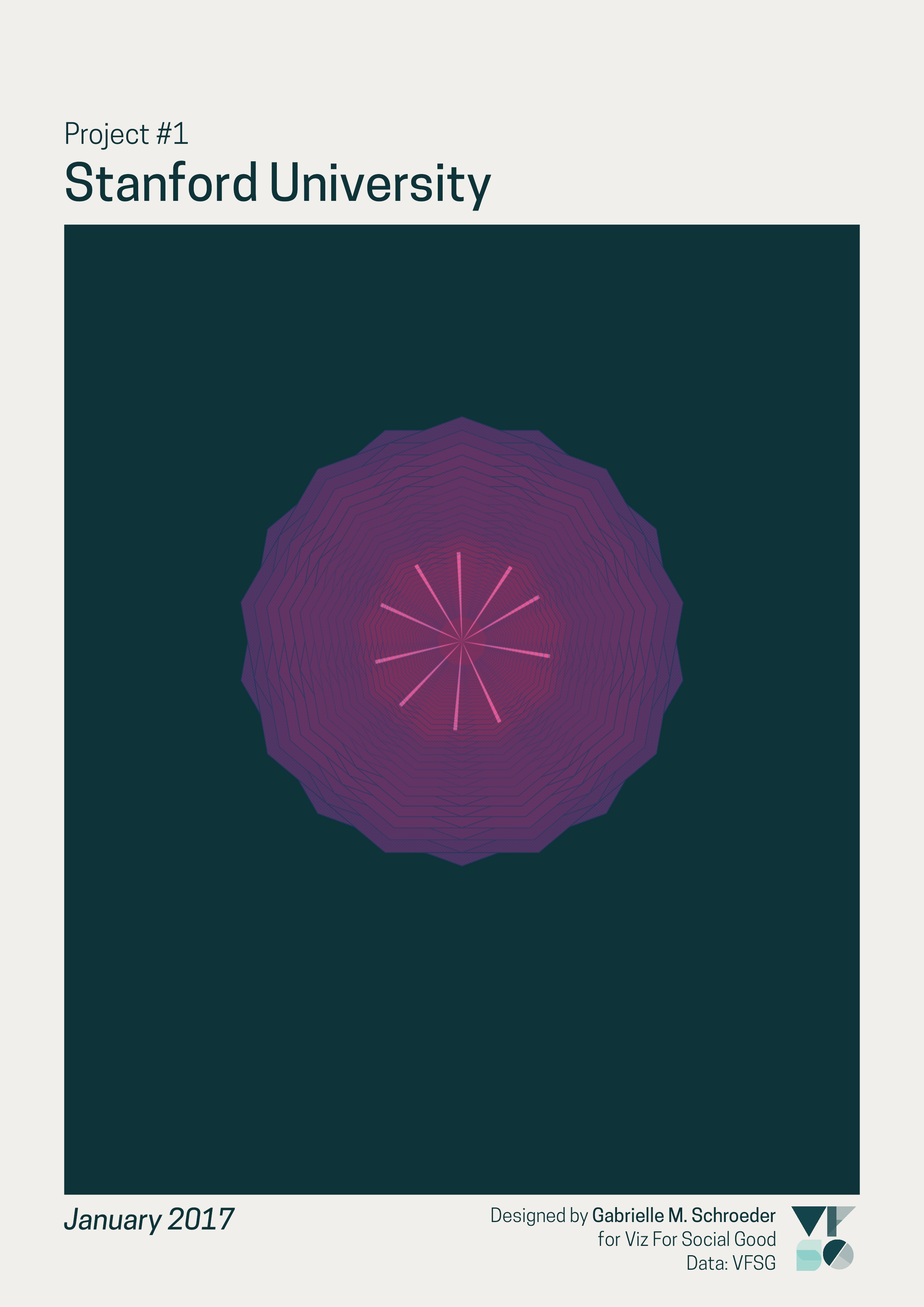
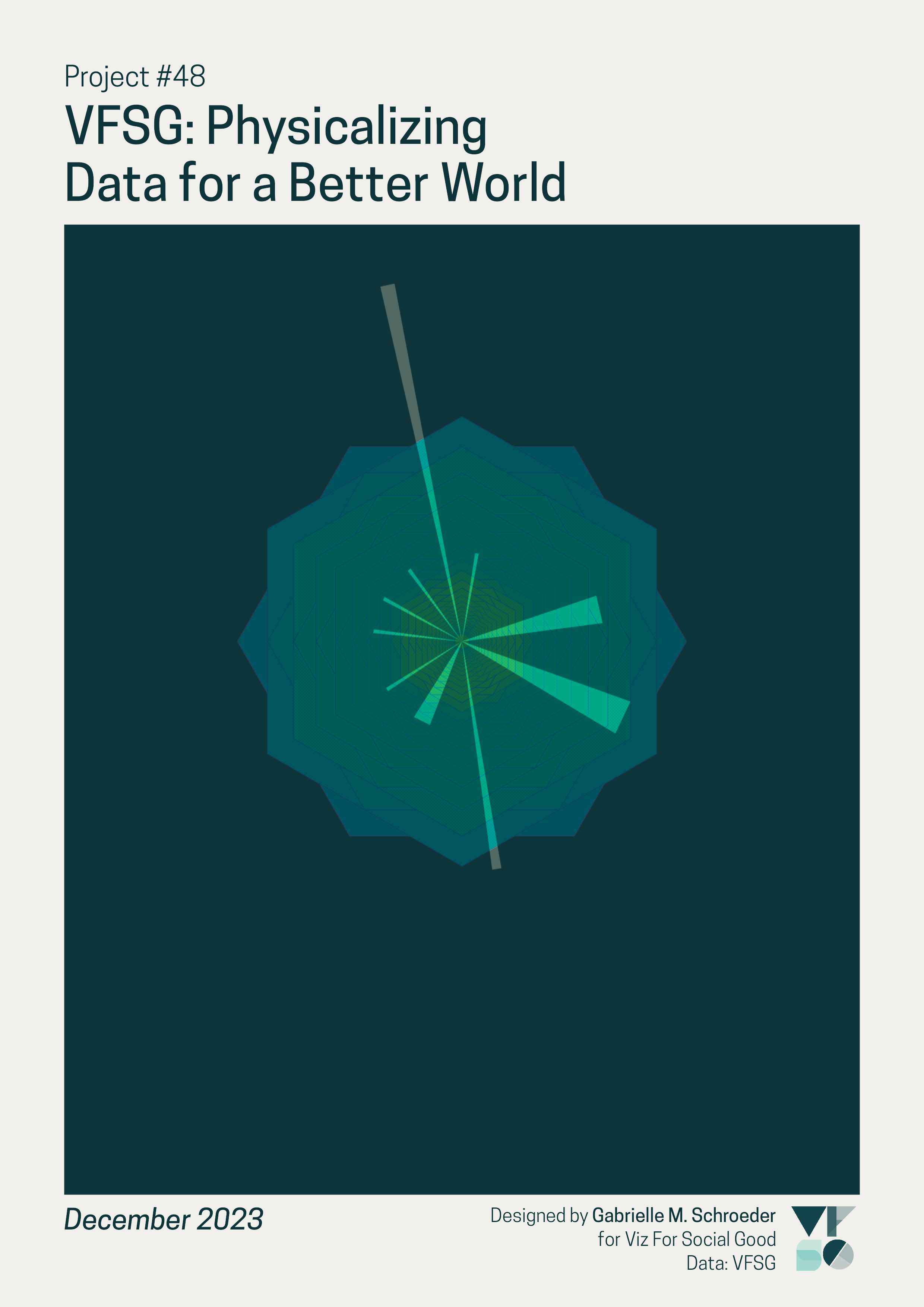
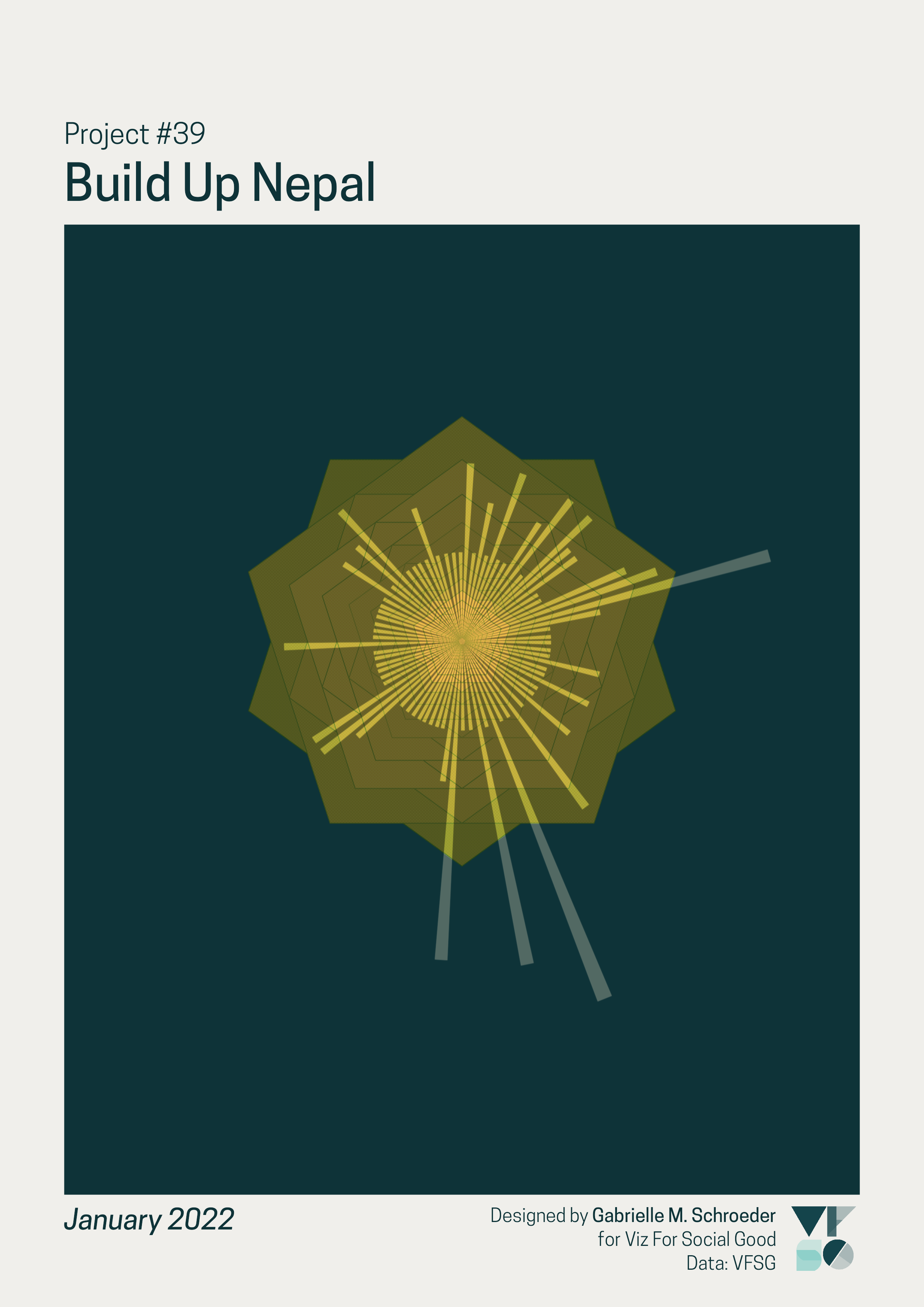
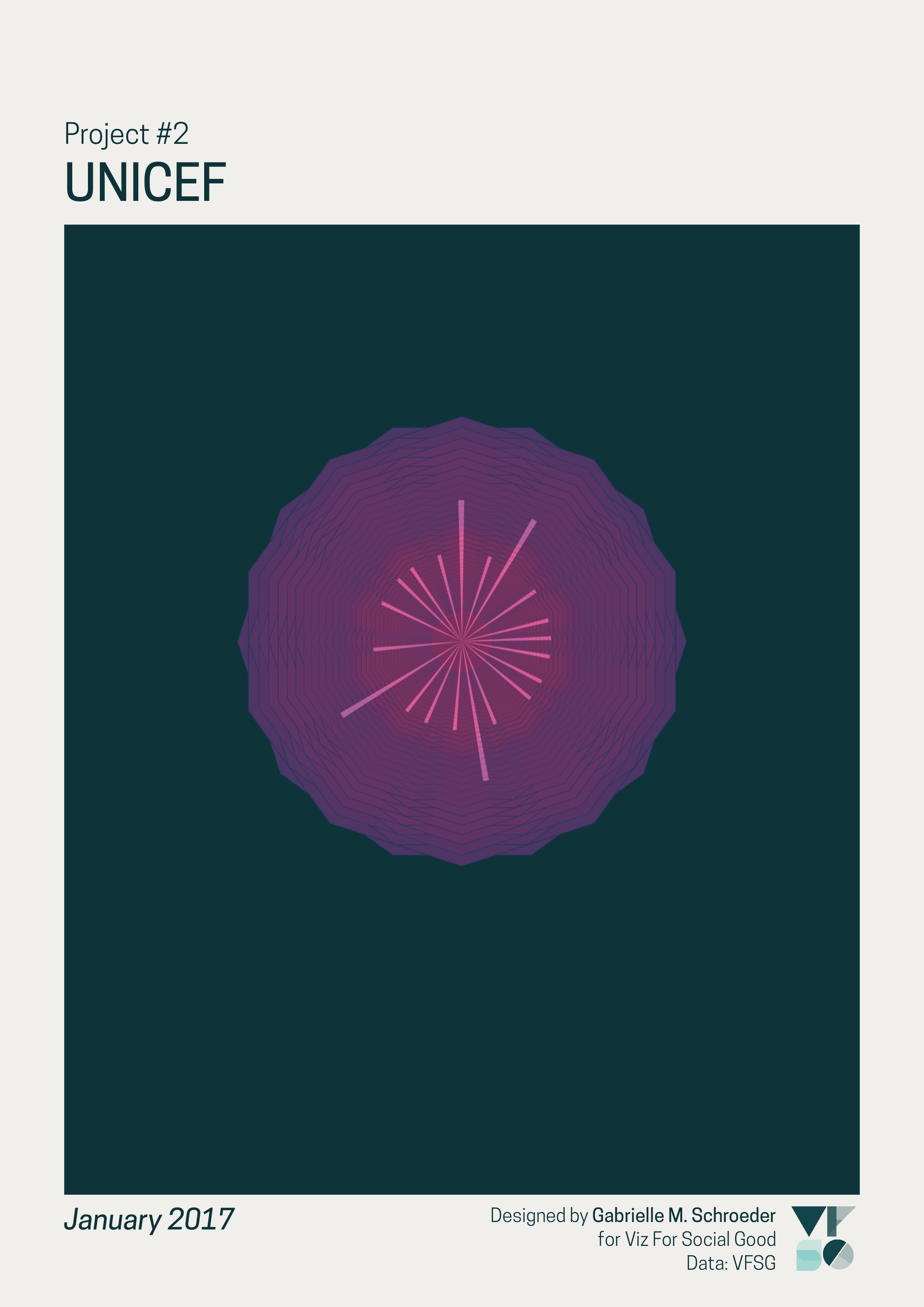
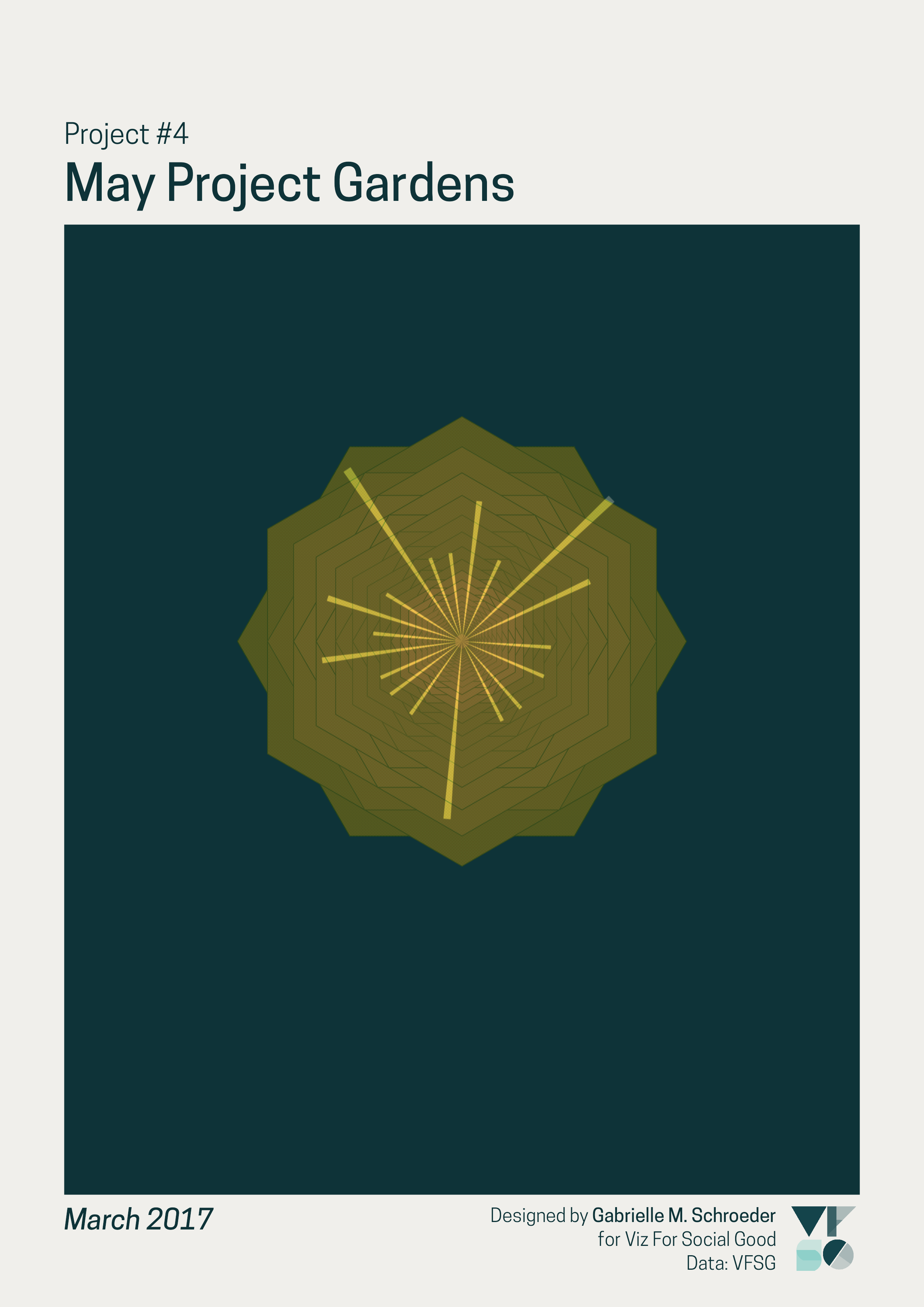
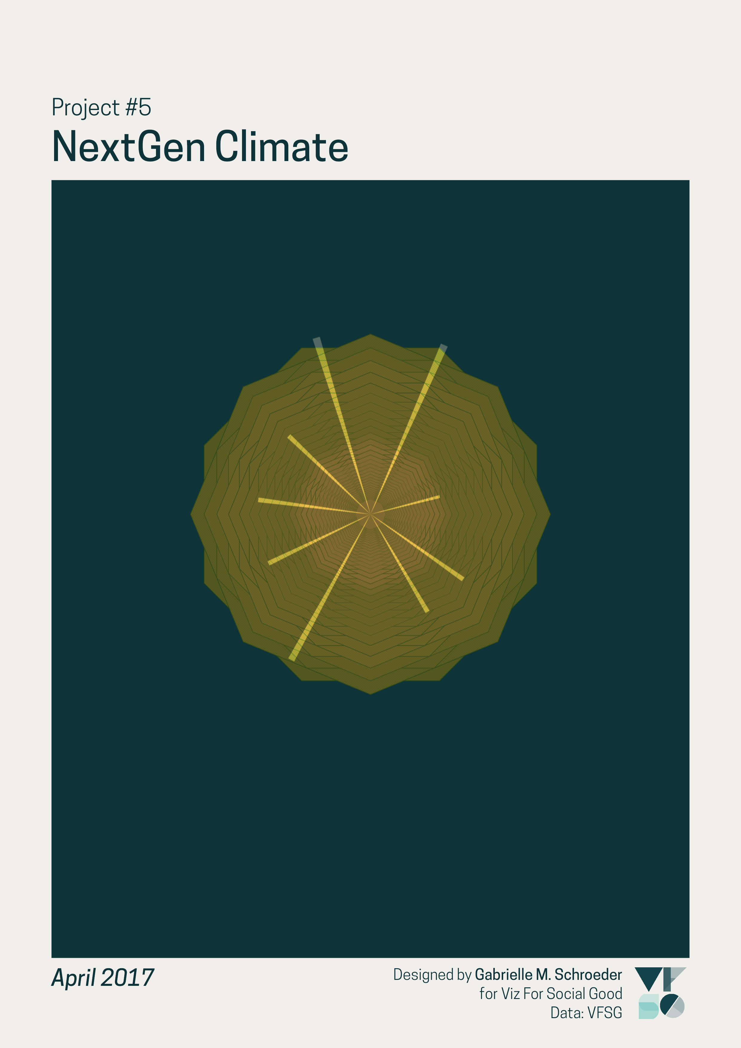
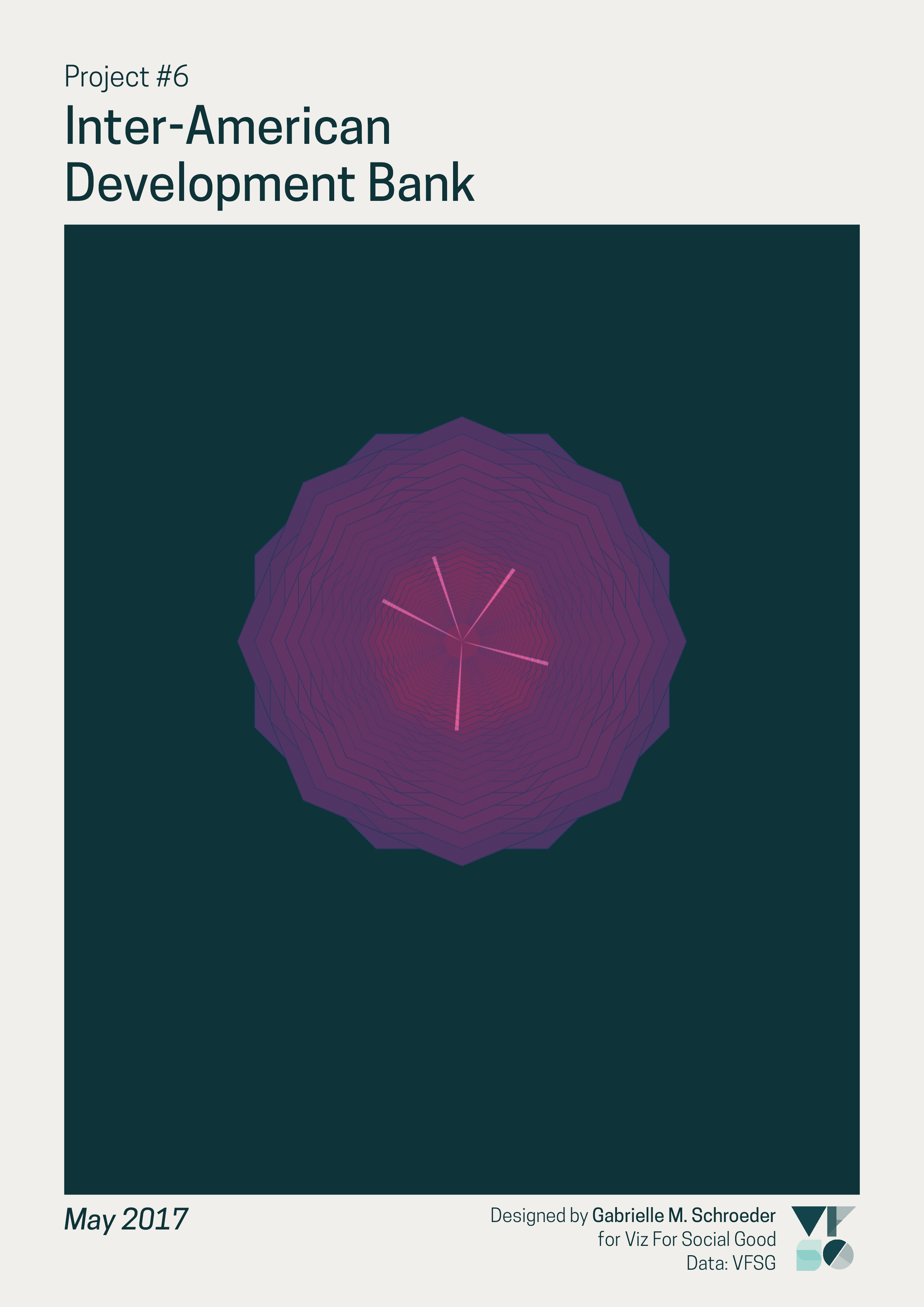
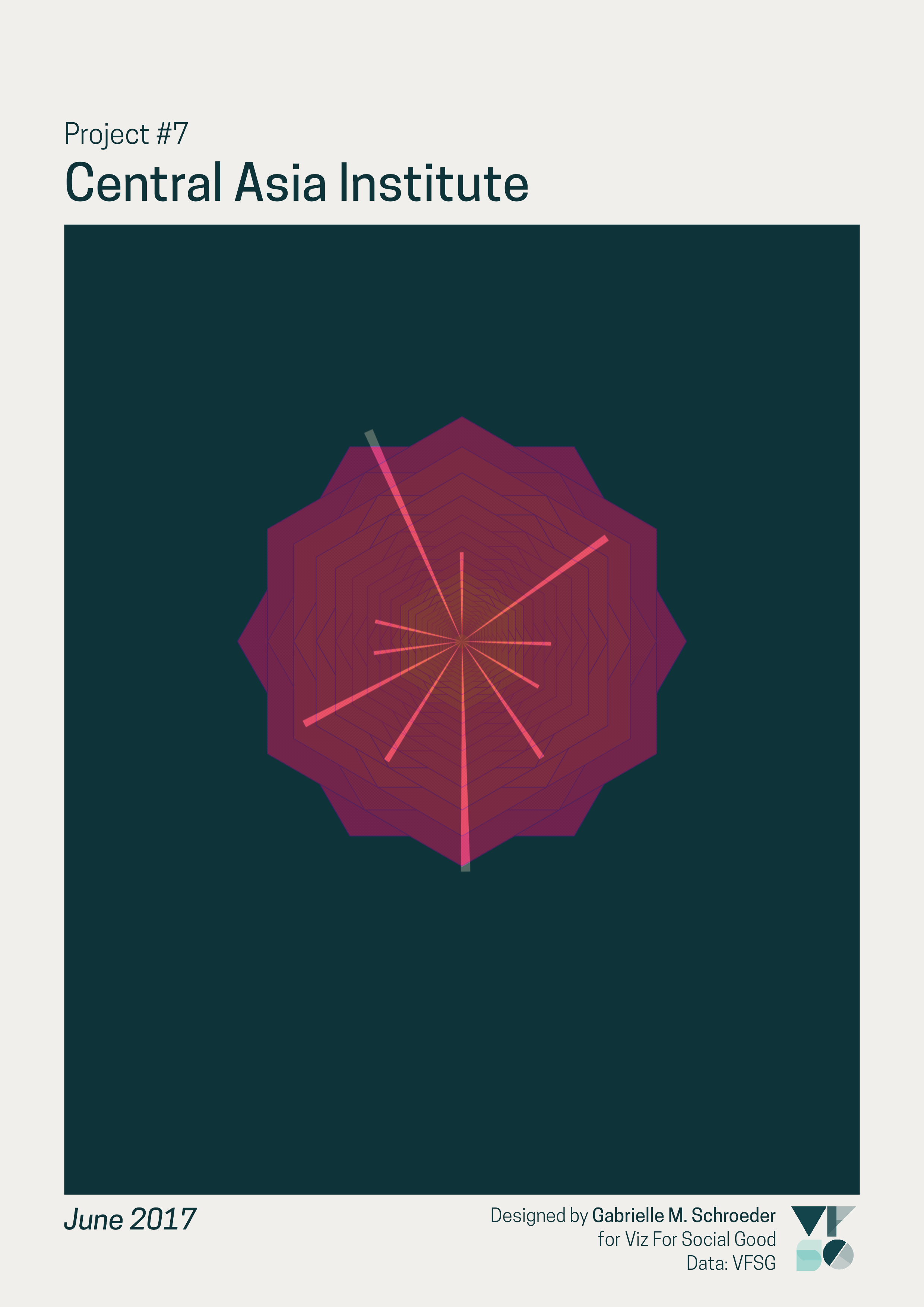
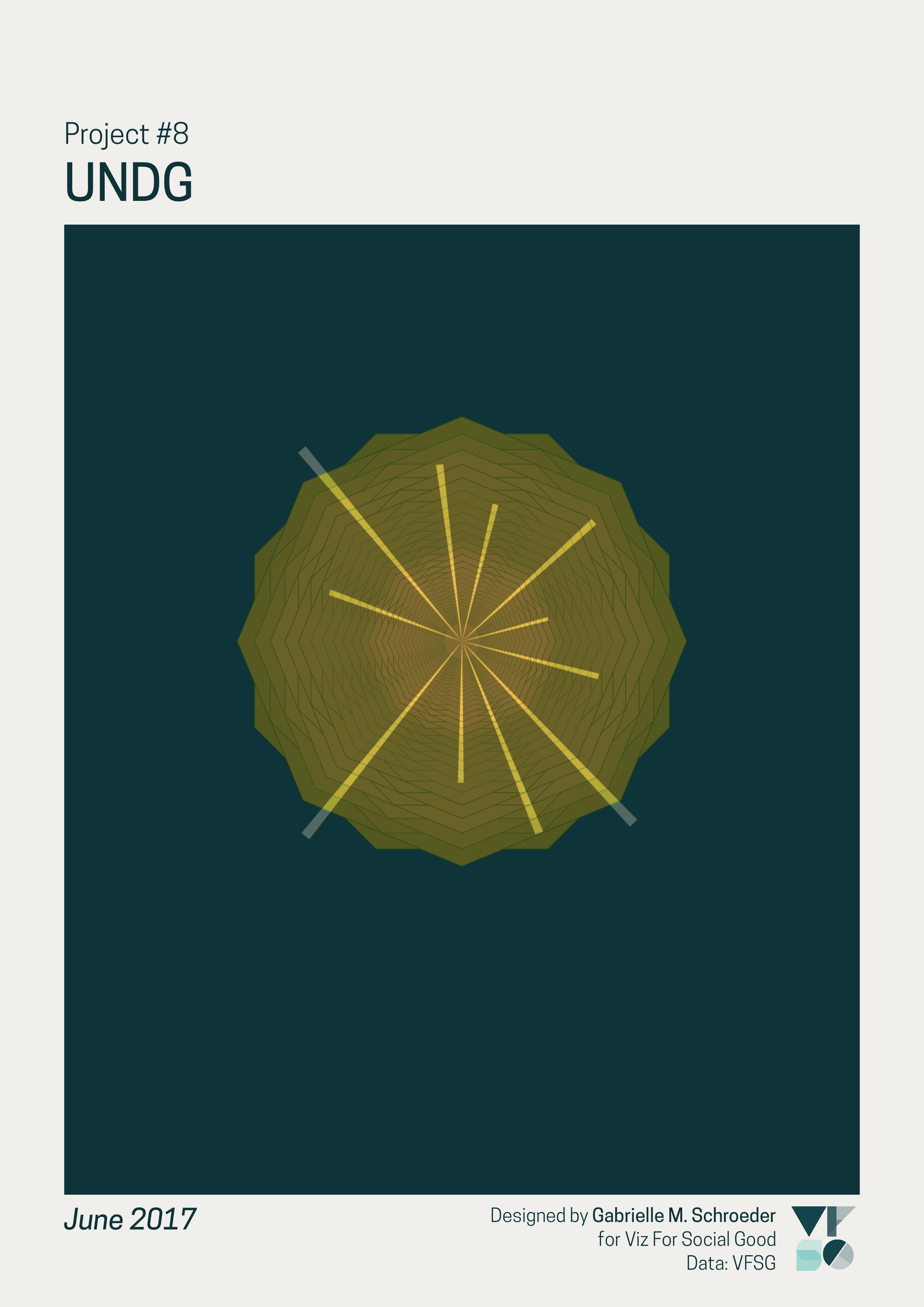
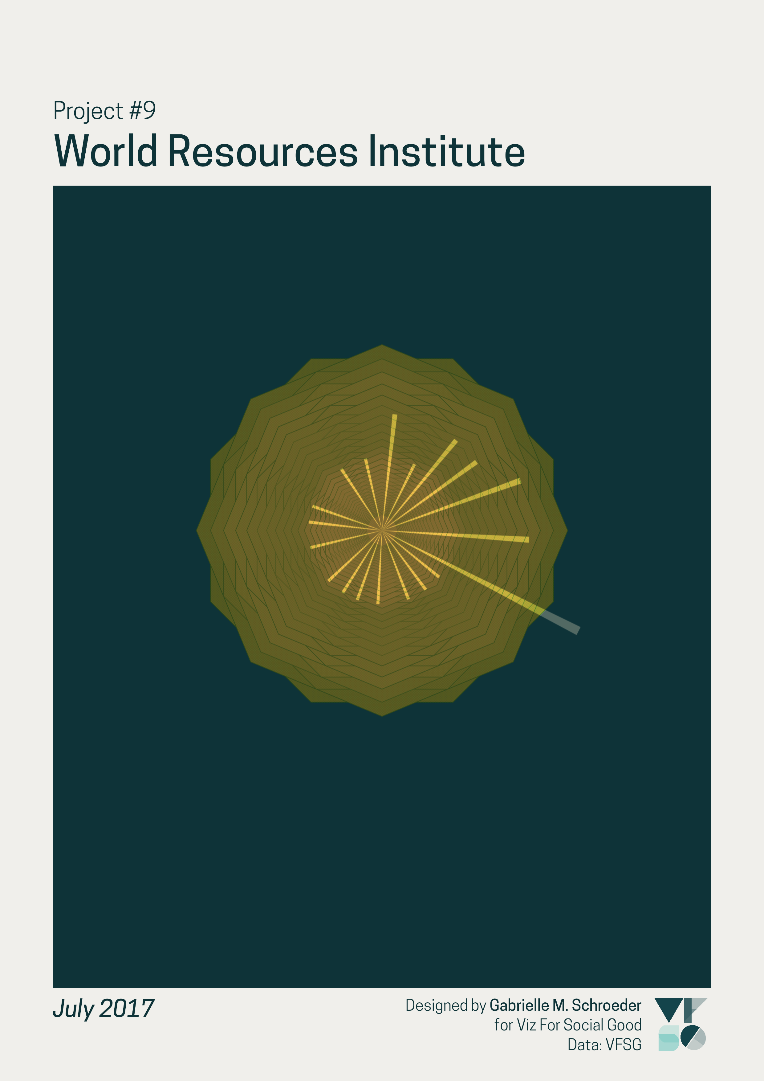
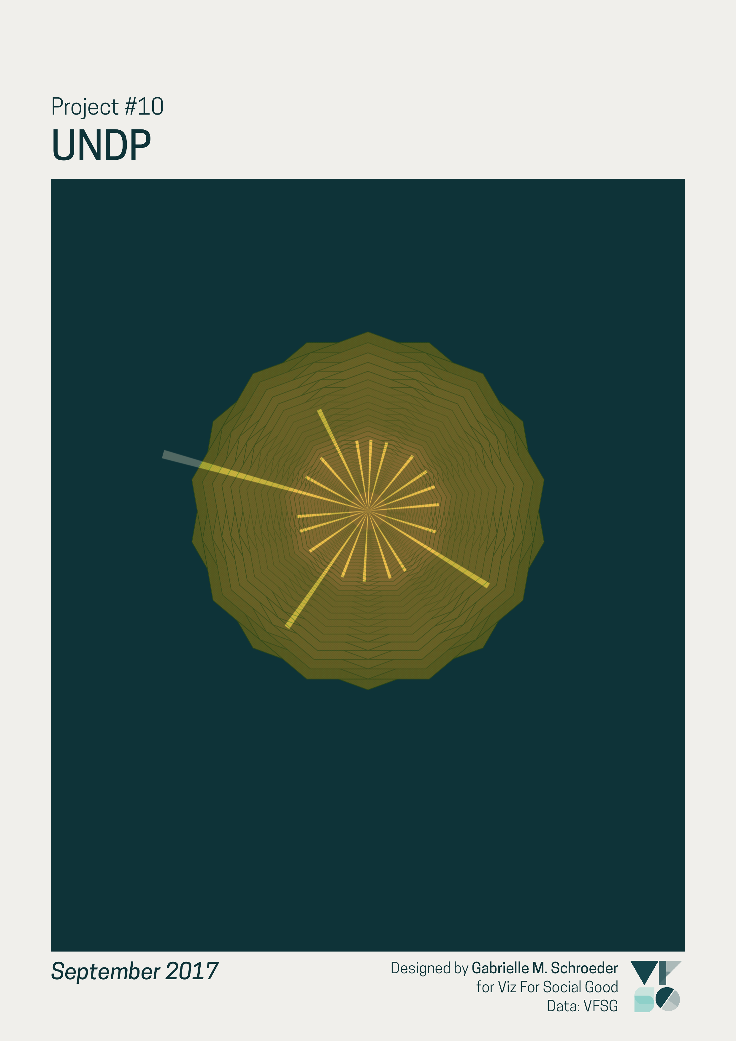
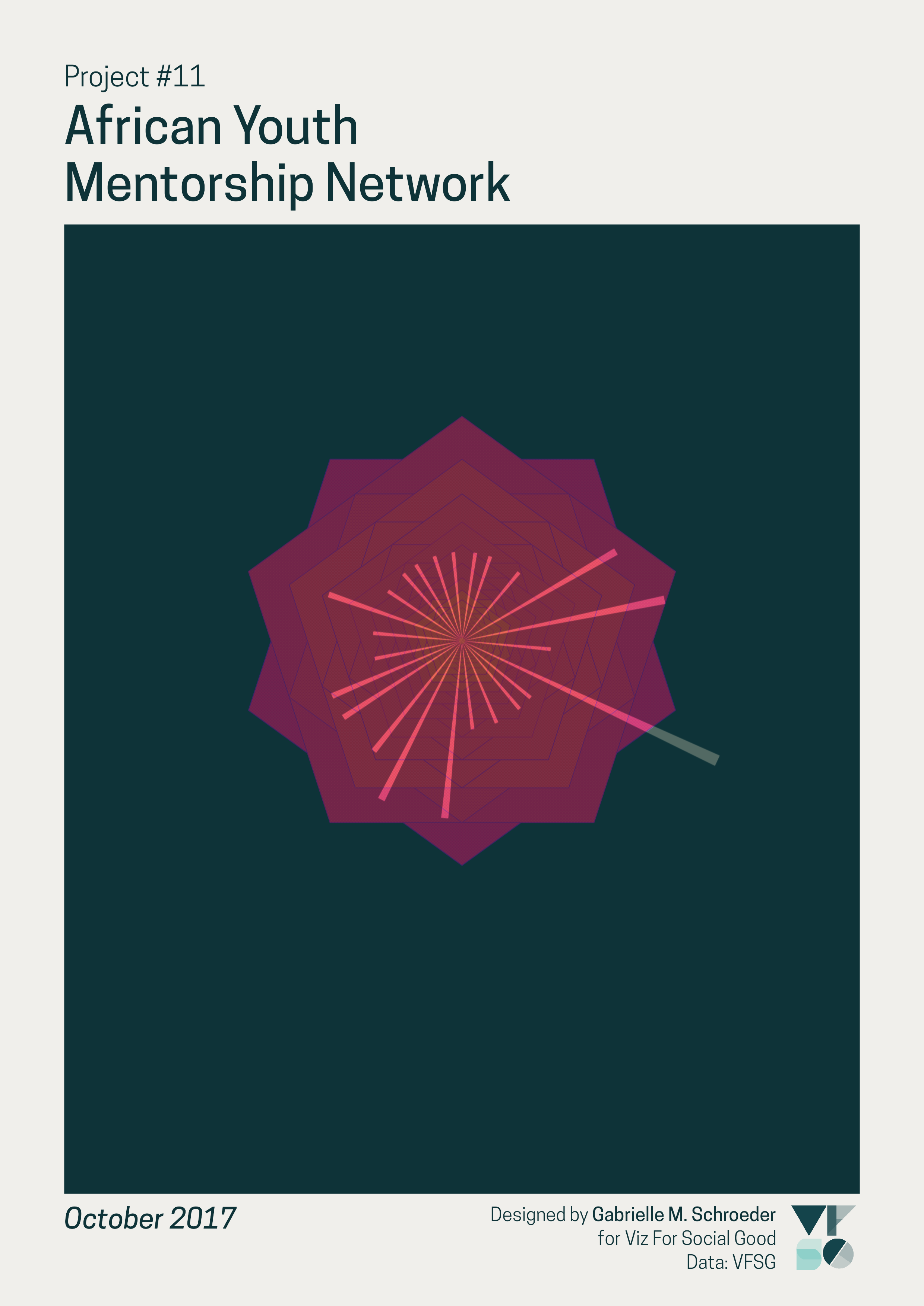
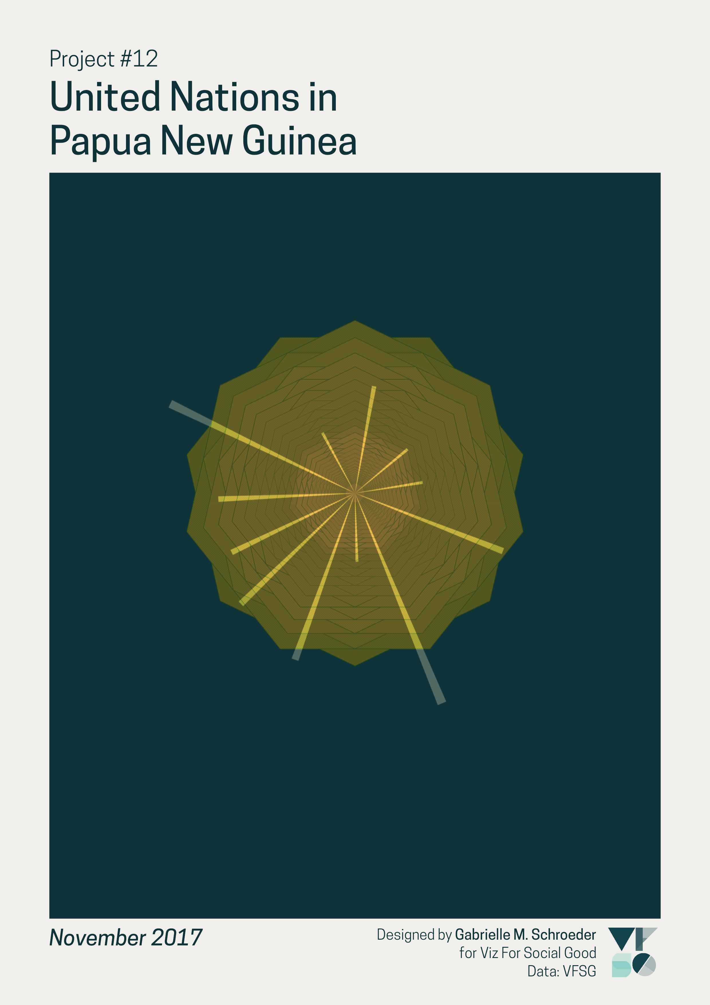
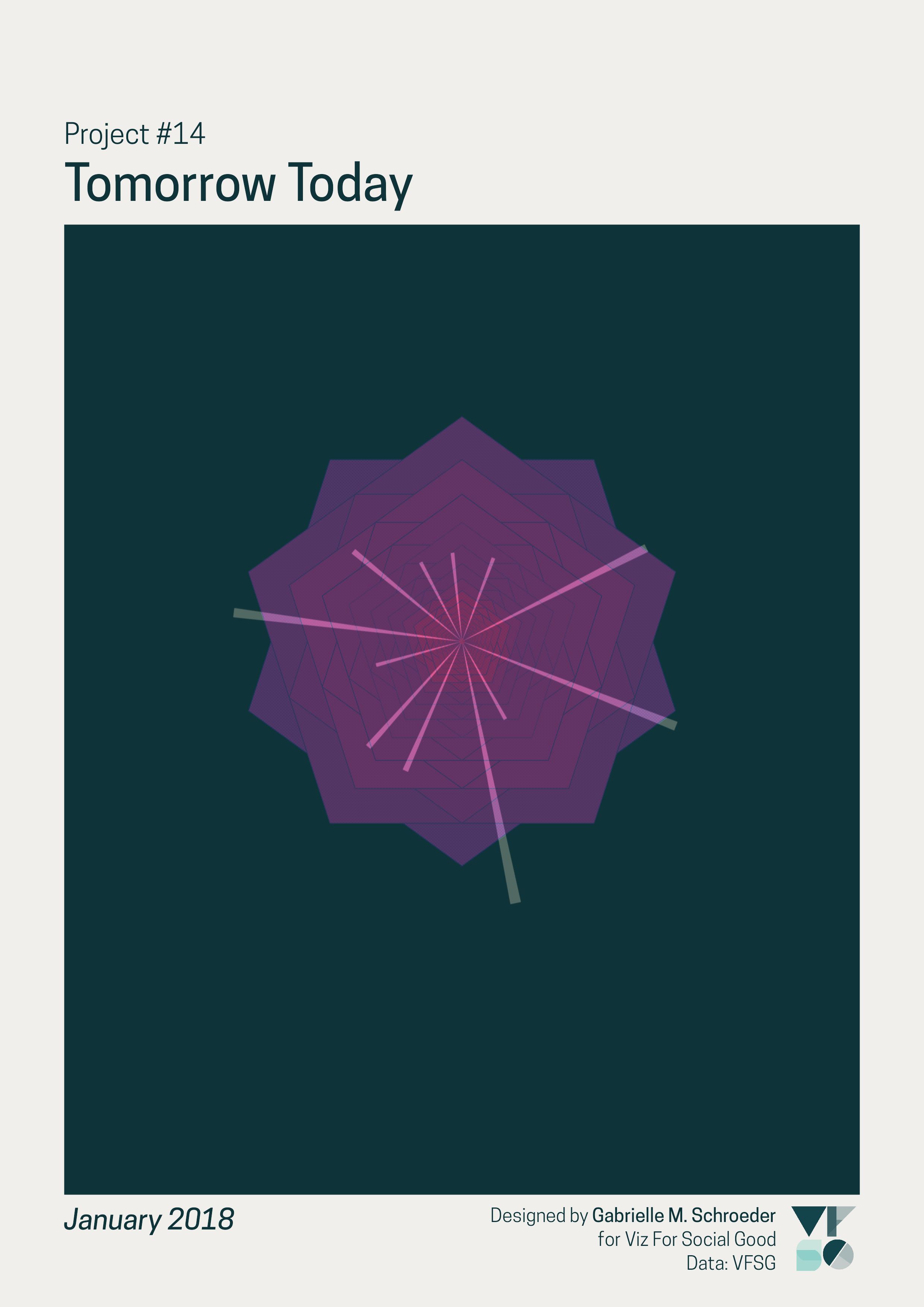
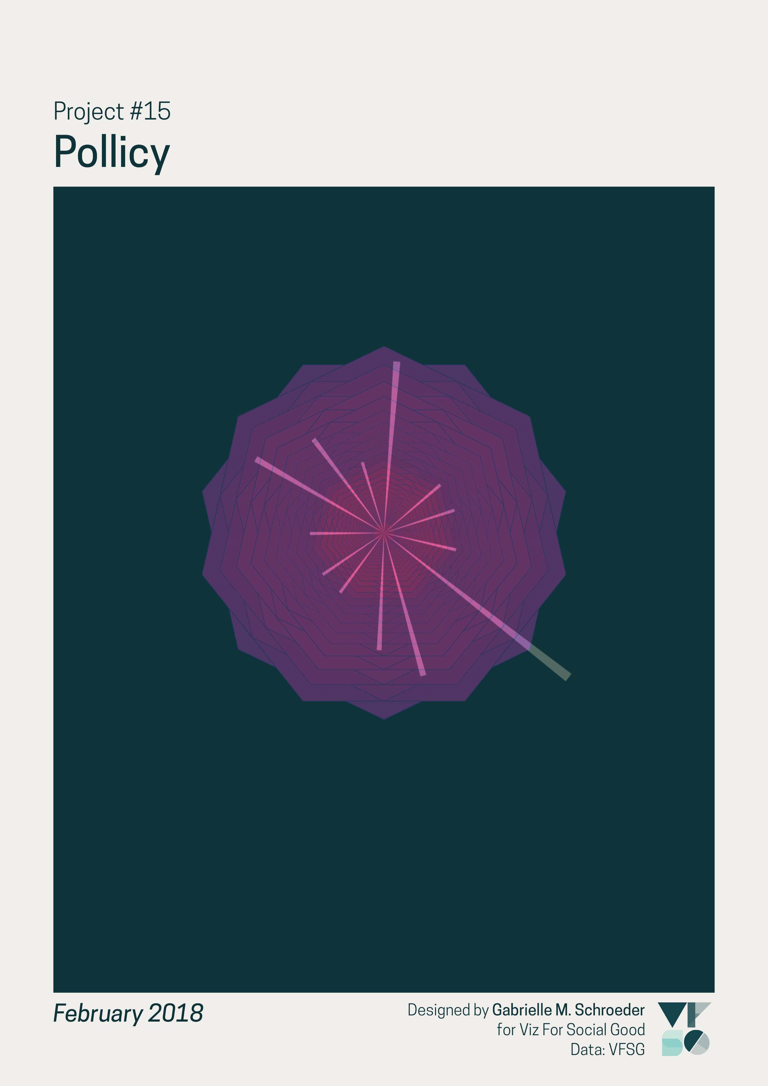
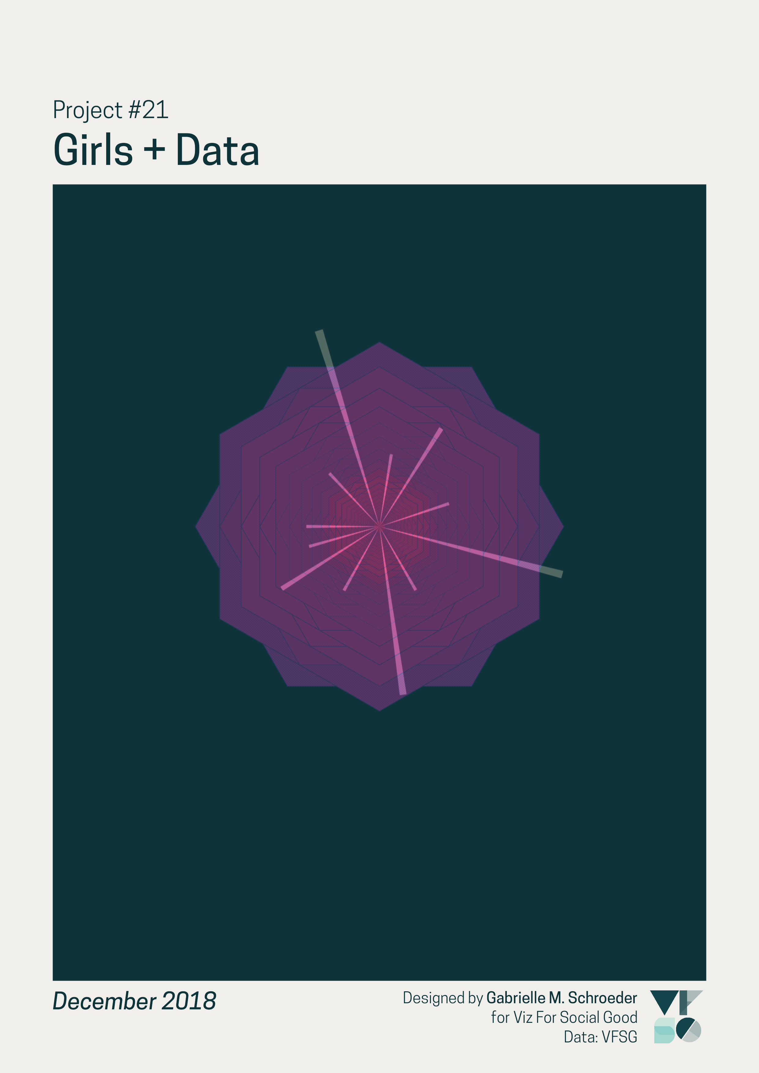
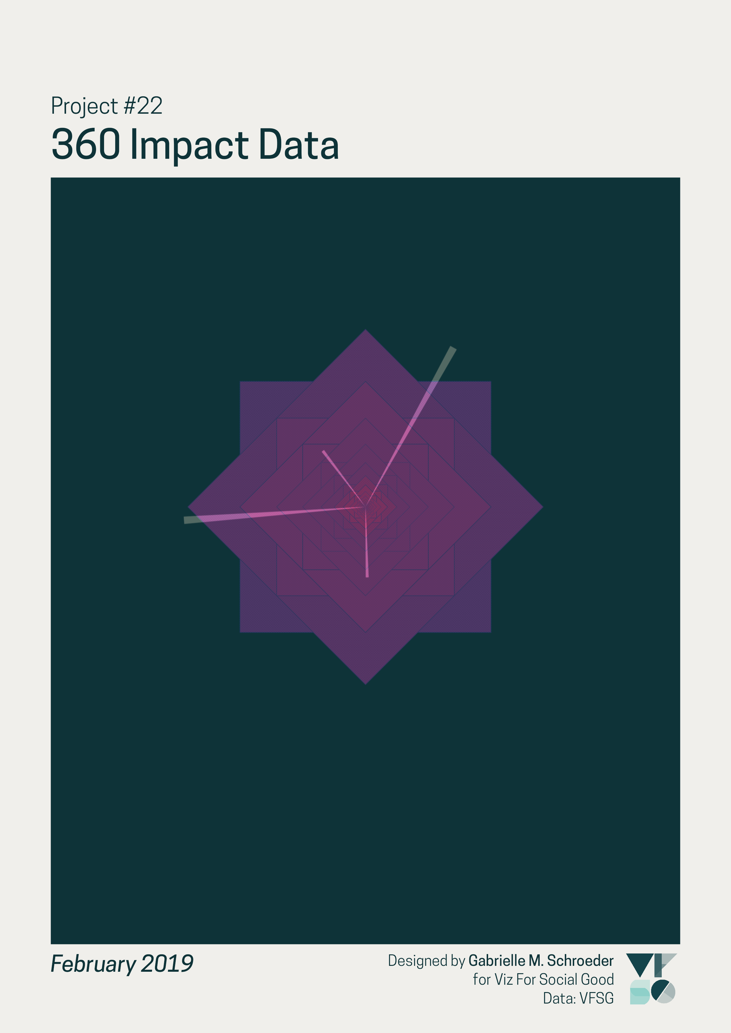
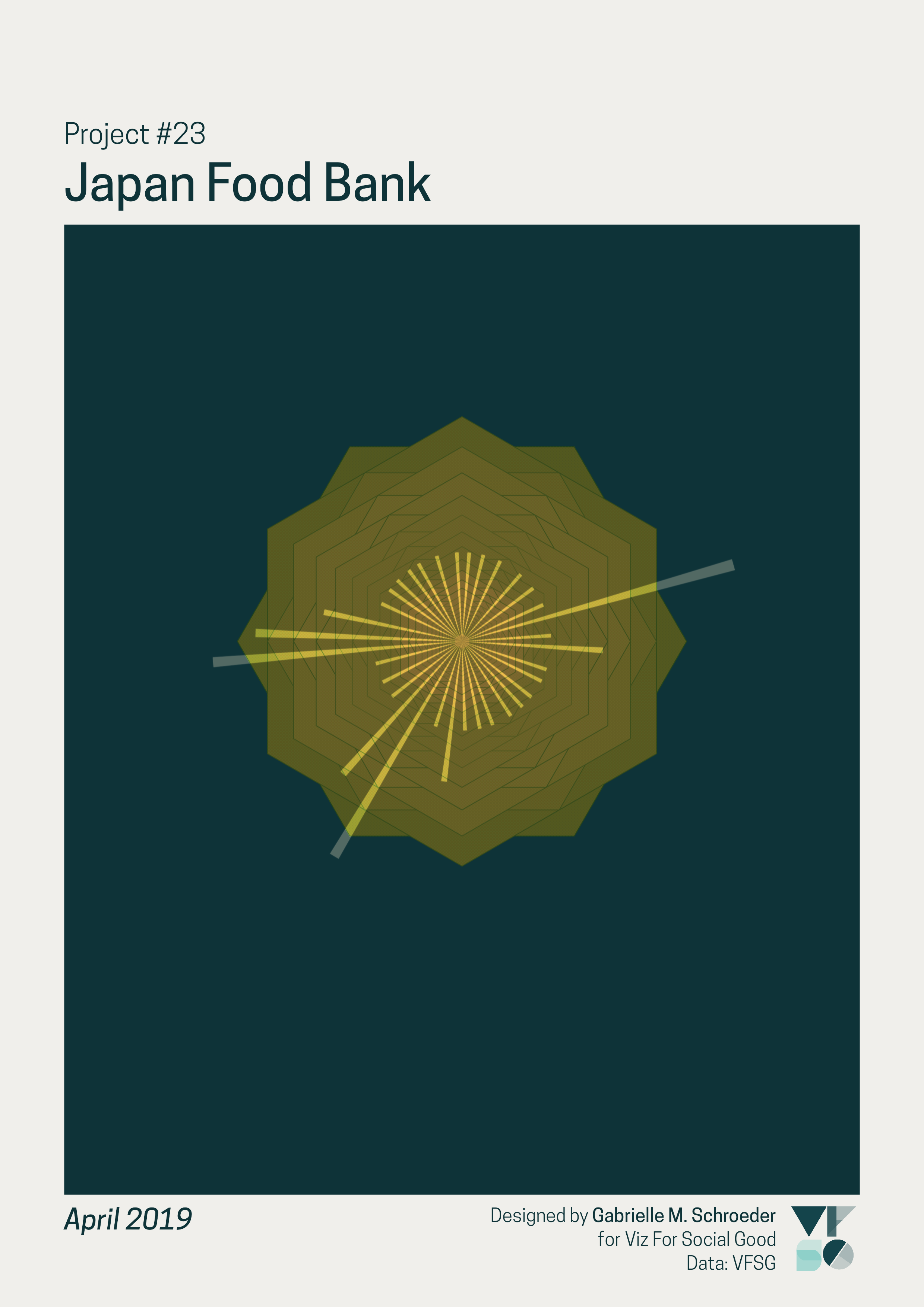
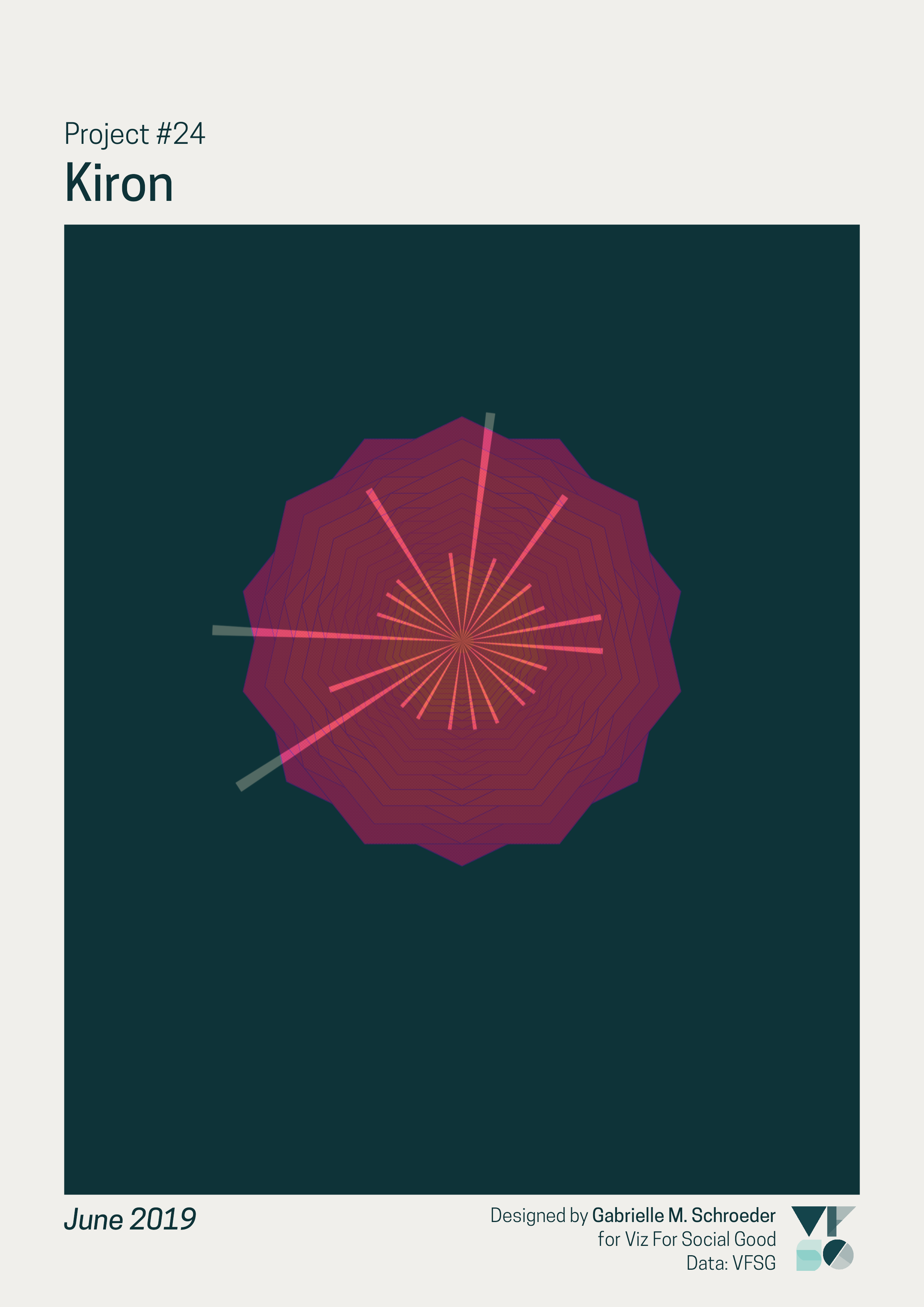
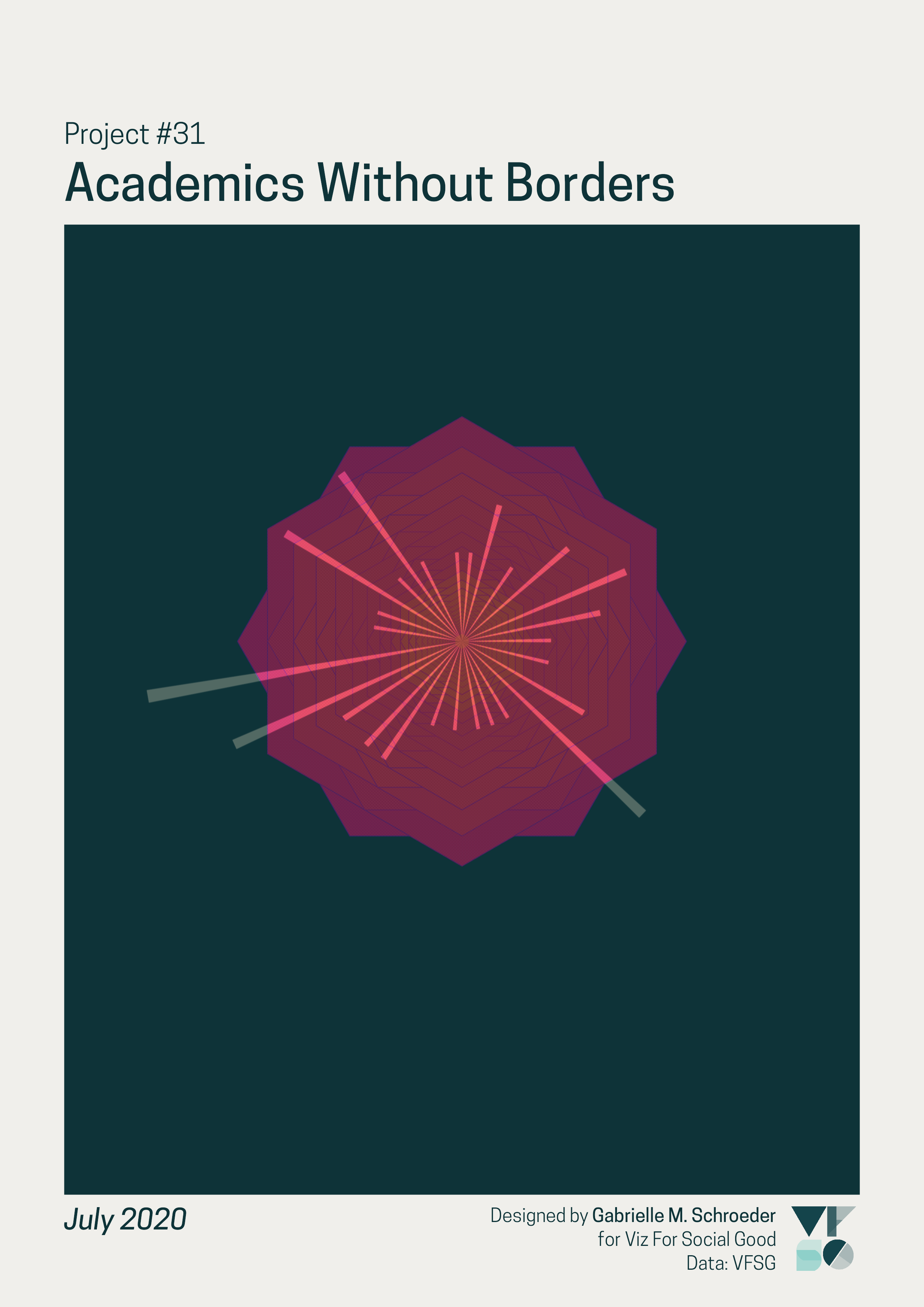
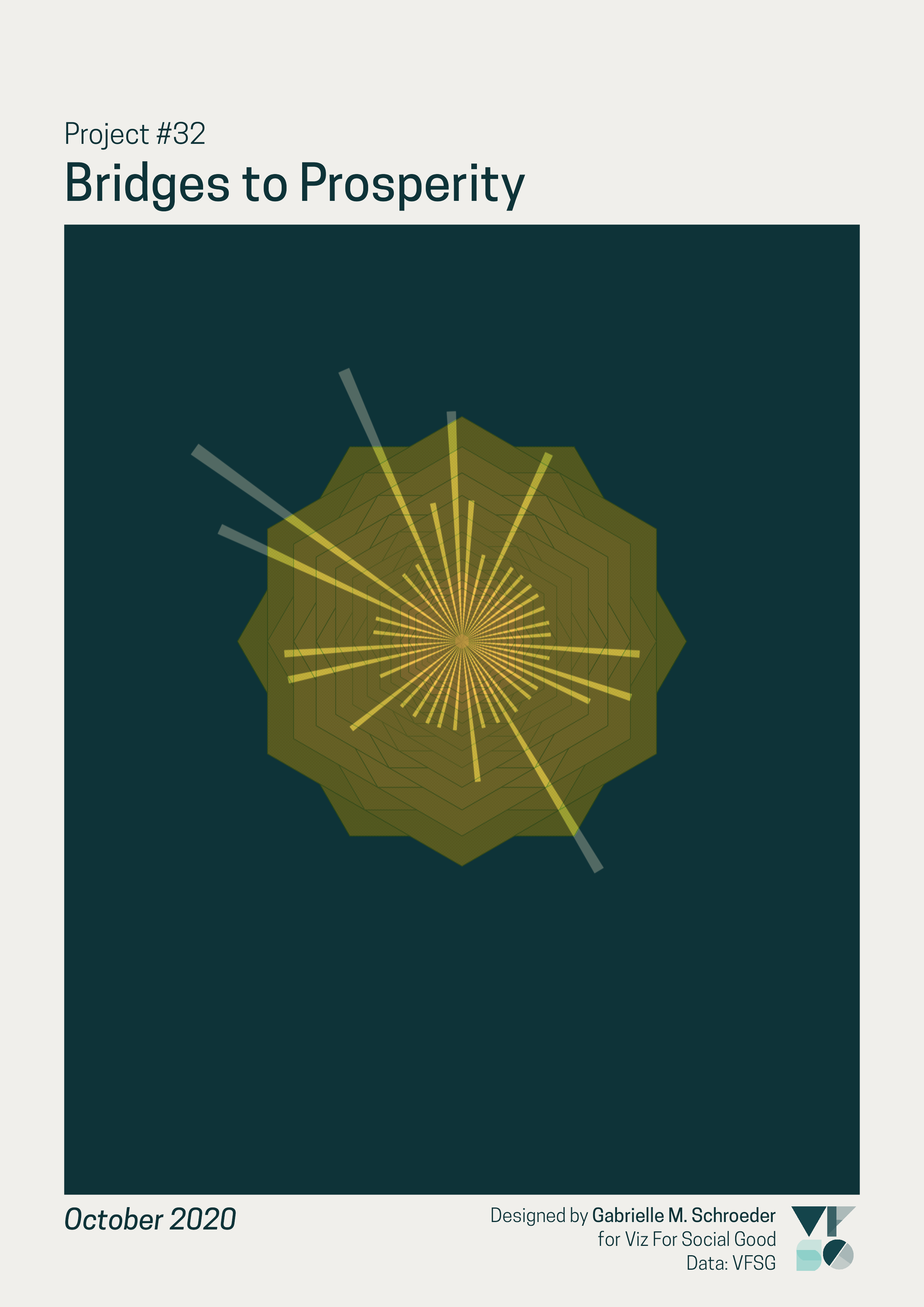
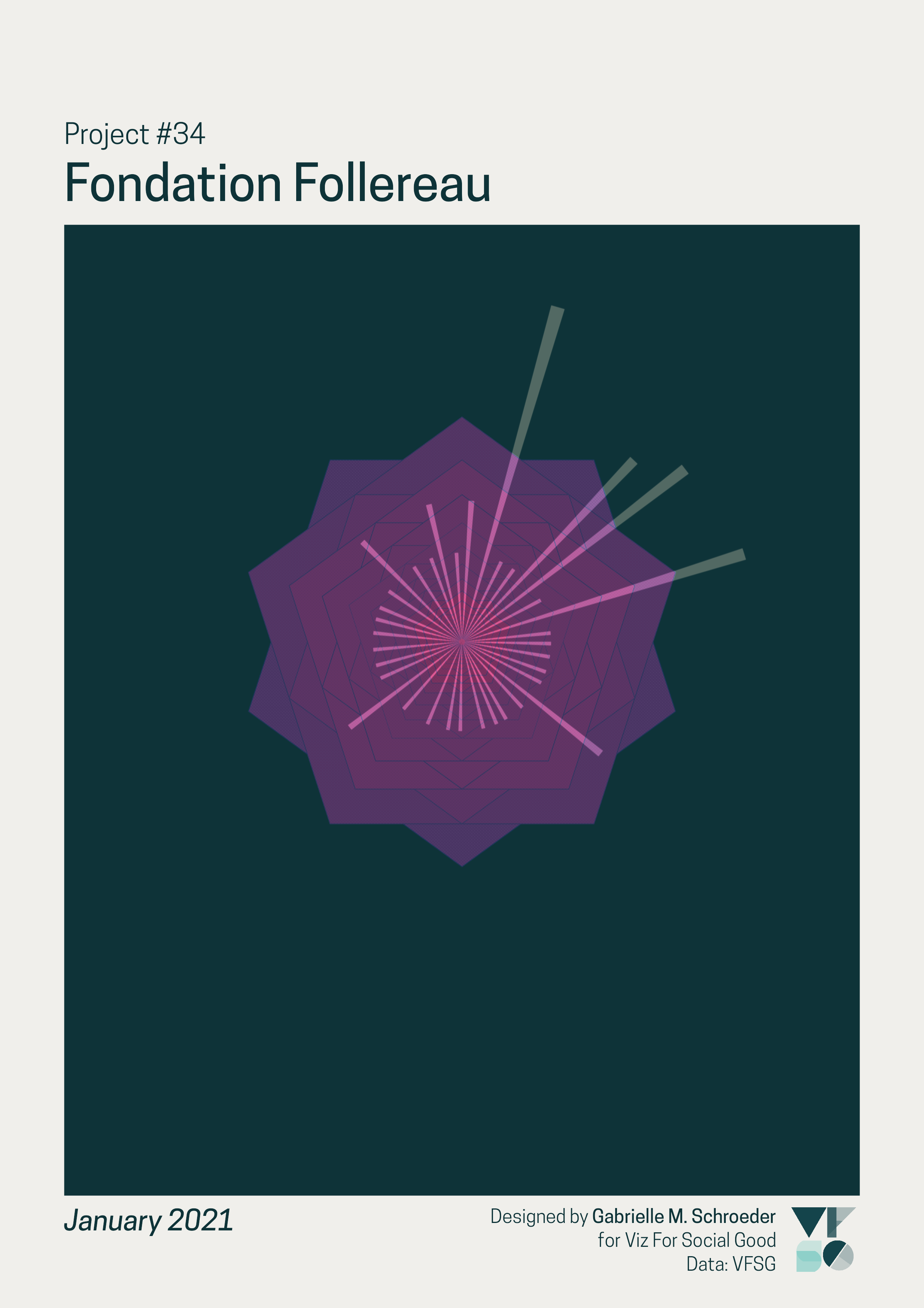
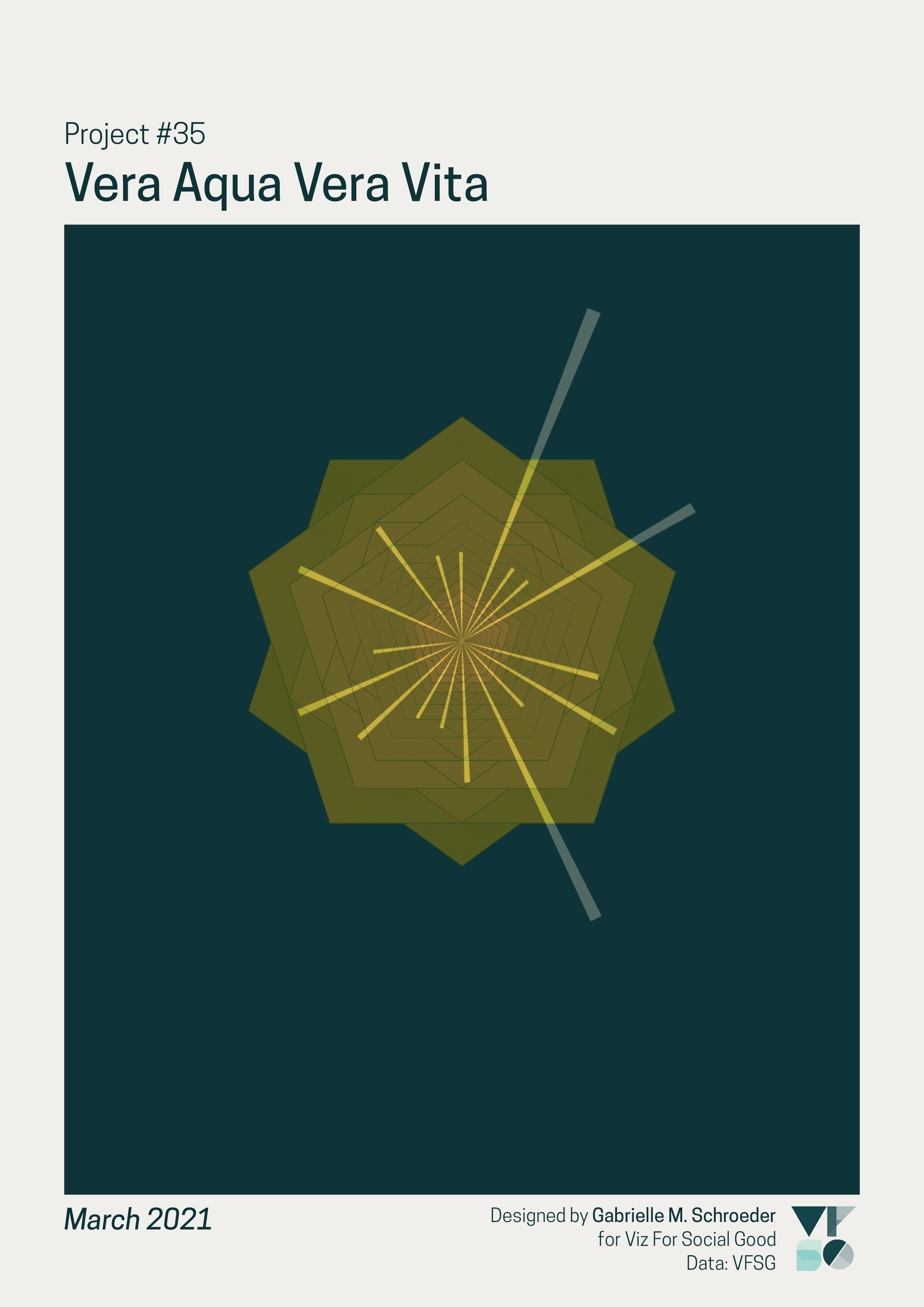
I used the projects brief’s description of VFSG’s visualisations as “beacon[s] of change” as inspiration. For each project, the volunteers’ visualisations are represented by rays of light that illuminate the mission and impact of the project’s non-profit partner (represented by the layered geometric shape).
Here are the pieces for the two projects I participated in last year (which are also two of my favourite outputs):
How to Read
Data art is not designed to be the most effective at encoding or analysing data - for example, it’s difficult to directly compare the number of visualisations submitted for different projects using these illustrations. However, I wanted the data encoding to be apparent so each piece provides a general impression of the project’s data.
Each submitted data visualisation is represented by one ray:
The corresponding non-profit for each project is represented by a geometric shape created by layering many regular polygons with the same number of sides. The number of sides is determined by the non-profit’s follower count on social media (more followers = more sides) as a rough approximation of its reach and recognisability. Smaller non-profits often benefit the most from VFSG’s work since they usually lack the resources for an internal data analysis team.
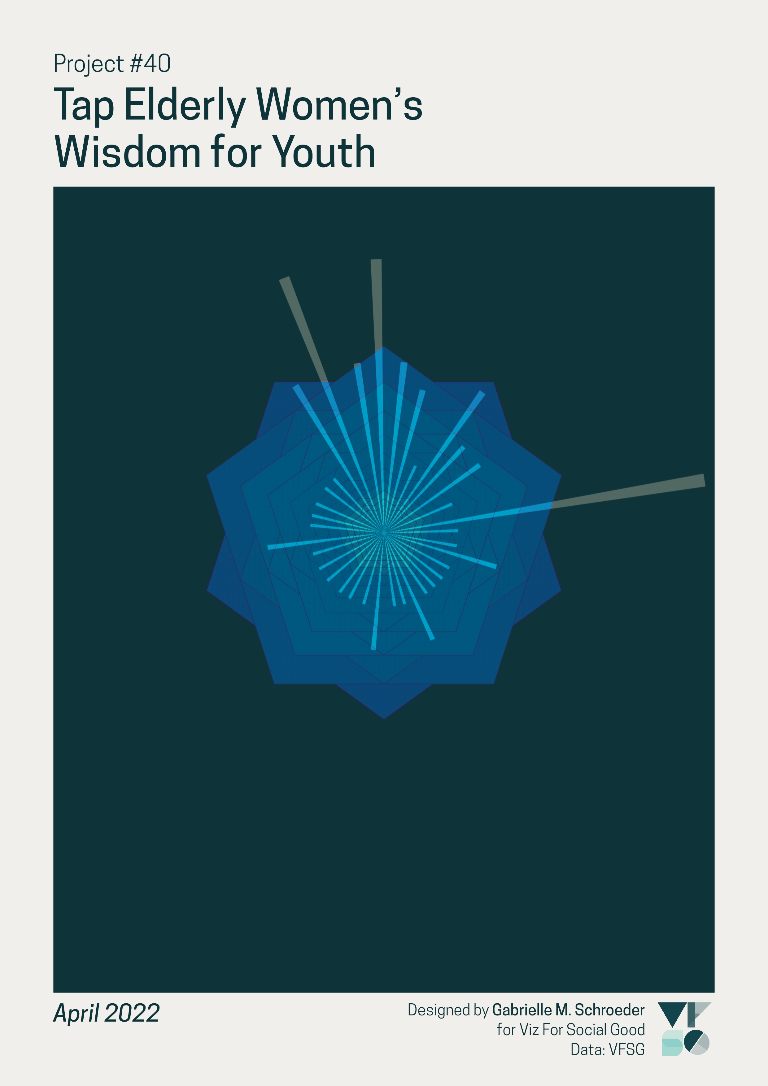
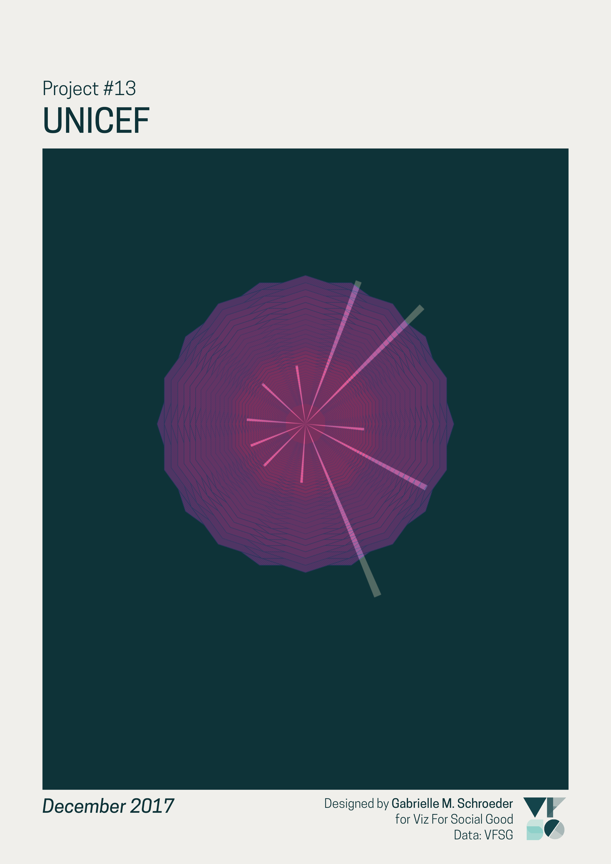
Tap Elderly Women’s Wisdom for Youth, with a little over a 100 followers on X (Twitter), vs. UNICEF, with over 9 million followers.
The colour of each shape is determined by the project’s primary topic. I grouped the provided topics into six broader categories:
- Education (pink/orange)
- Amplifying voices (i.e., broadcasting the work and missions of other people or organisations across multiple categories) (yellow orange)
- Infrastructure, resources, and sustainability (yellow)
- Environment and conservation (teal/green)
- Health (blue)
- Welfare, rights, and equality (purple)
Examples of the above categories, from left to right:
(proper legend for the non-profits TBA!)
Highlighted examples
Previous projects using VFSG data:
VFSG’s first and latest projects:
The project with the highest number of submissions:
The first project featuring presented visualisations:

All projects

Data cleaning and analysis
I used R (code in this GitHub repo) for the data analysis and visualisations. VFSG provided all of the data except for the non-profit social media follower counts.
Collaborations
Sometimes, volunteers work together and submit a collaborative visualisation. I counted each unique collaboration as a separate “volunteer” when calculating volunteer submission numbers. However, a collaborative submission also counts towards the total number of submissions of the individual volunteers in the collaboration. This approach only makes a difference to the submission counts of volunteers who submitted a collaborative visualisation and then a solo visualisation for a later project.
Project topics
VFSG assigned 20 different topics to the 48 projects. To focus on high-level differences in project topics, I grouped these topics into six more general ones:
- “Environmental Impact” and “Conservation” were collapsed into Environment and conservation.
- “Homelessness,” “Financial support,” “Human Rights,” “Gender Equality,” “Crisis,” “Children and Youth,” and “Recycling” were were grouped into Welfare, rights, and equality. At first, “Recycling” might seem like a better fit for Environment and conservation. However, the “Recycling” project was Furniture Bank, whose primary focus is a welfare and equality challenge: ending furniture poverty.
- Education and Health were already large, distinct categories, and I kept these in the simplified list. Health includes both the original “Health” and “Healthcare” topics.
- I combined “Energy/ Sustainability,” “Energy,” “Sanitation,” “Water management,” “Infrastructures,” and “Sustainable Development” into Infrastructure, resources, and sustainability.
- The remaining original topics were “Data” (for past projects on VFSG’s impact) and “Community” (for projects with Video Volunteers and Fondation Follereau). Fondation Follereau’s project fit well in Welfare, rights, and equality. VFSG and Video Volunteers were both similar in that they help raise awareness of a range of issues by helping individuals and organisations. I therefore created a new category, Amplifying voices, to describe these projects.
Many projects could belong to multiple categories, especially due to the interactions between many of these categories. Despite these limitations, these groupings provide a general impression of the types of organisations VFSG has collaborated with.
Follower counts
I manually collected each non-profit’s number of followers on X (Twitter) on 12 April, 2024, to provide a rough measure of the non-profit’s reach and level of recognition. The number of sides in each visualisation is a log-transformed and scaled version of the follower count. The Keith Richardson Foundation does not have an X account, so I used their Instagram follower count instead. This measure could be improved by summarising follower information from multiple social media accounts.
License: CC BY-NC 4.0